


Dark paint colours have emerged as a powerful tool in contemporary interior design, transforming ordinary spaces into sophisticated sanctuaries. Whilst many homeowners traditionally gravitate towards lighter shades to create an illusion of space, designers increasingly embrace the drama and depth that darker hues bring to residential and commercial environments. These rich, saturated tones possess an inherent ability to add layers of complexity, warmth, and undeniable glamour to any room. When applied thoughtfully, dark colours create striking focal points, enhance architectural features, and establish an atmosphere of refined elegance that lighter palettes simply cannot achieve.
The elegance of deep black
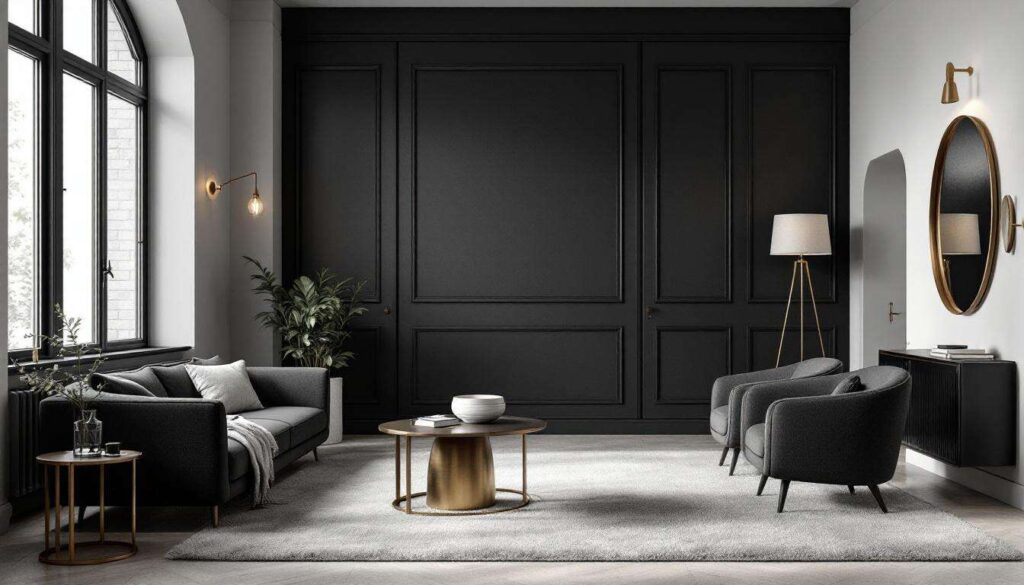
Creating dramatic impact with the darkest shade
Deep black remains the ultimate statement colour in luxury interior design, offering unparalleled sophistication when executed correctly. Designers favour black for its ability to ground a space whilst simultaneously adding an element of theatrical drama. This versatile shade works exceptionally well in dining rooms, libraries, and powder rooms where intimate atmospheres enhance the overall experience.
The key to successfully implementing black lies in understanding its relationship with light and texture. Consider these essential factors:
- Natural light availability and window placement
- Artificial lighting schemes including layered illumination
- Surface finish selection between matte, satin, and gloss
- Complementary furnishings in contrasting or tonal shades
- Architectural details that benefit from highlighting
Balancing darkness with strategic design elements
Professional designers understand that black walls require careful counterbalancing to prevent spaces from feeling oppressive. Incorporating metallic accents in brass, gold, or chrome introduces reflective surfaces that bounce light throughout the room. Textured fabrics such as velvet, silk, and linen add dimension whilst maintaining the luxurious aesthetic. White or cream ceilings create essential contrast, drawing the eye upward and preserving a sense of height.
| Room Type | Recommended Black Finish | Ideal Accent Colour |
|---|---|---|
| Dining Room | Matte or Eggshell | Brass or Gold |
| Bedroom | Matte | Soft Blush or Cream |
| Bathroom | Satin or Semi-Gloss | Marble White |
Beyond black’s dramatic possibilities, another deeply saturated colour offers a more approachable yet equally glamorous alternative.
Mystery of navy blue
Timeless appeal of this sophisticated hue
Navy blue presents a refined alternative to black whilst maintaining comparable depth and richness. This classic colour evokes associations with maritime heritage, military precision, and traditional elegance. Designers appreciate navy’s remarkable versatility, as it complements both warm and cool colour schemes whilst adding substantial visual weight to interiors.
Navy blue particularly excels in creating calming yet distinguished environments in bedrooms, home offices, and living spaces. Unlike lighter blues that can feel cold, navy possesses inherent warmth that makes rooms feel cocooning rather than stark.
Pairing navy with complementary elements
The success of navy blue depends largely on thoughtful coordination with surrounding elements. Natural materials such as oak, walnut, and rattan provide organic contrast against navy’s formality. Crisp white trim, skirting boards, and ceiling roses create architectural definition whilst preventing the colour from overwhelming the space. Brass hardware and light fixtures introduce warmth that counteracts any potential coolness.
- Combine with caramel leather for classic sophistication
- Layer with ivory textiles for softness
- Introduce coral or terracotta accents for vibrancy
- Pair with natural jute or sisal flooring
Whilst navy offers timeless elegance, another jewel-toned shade brings nature-inspired luxury indoors.
Refinement of emerald green
Bringing opulent colour into modern spaces
Emerald green has experienced a remarkable resurgence in high-end interior design, prized for its luxurious jewel-like quality and connection to nature. This rich, saturated green evokes the glamour of Art Deco interiors whilst feeling entirely contemporary. Designers utilise emerald to create spaces that feel both grounded and aspirational, combining the calming properties of green with the drama of darker tones.
This sophisticated shade works particularly well in formal living rooms, master bedrooms, and feature walls where its intensity can be fully appreciated. Emerald’s unique position between blue and yellow on the colour spectrum allows it to adapt to various lighting conditions throughout the day.
Enhancing emerald’s natural glamour
To maximise emerald green’s impact, designers incorporate materials that enhance its inherent richness. Velvet upholstery in emerald creates sumptuous seating that invites touch. Marble surfaces with green veining echo the wall colour whilst introducing pattern and variation. Antique mirrors and crystal lighting fixtures add sparkle that prevents the space from feeling too heavy.
| Material Pairing | Effect Achieved | Best Application |
|---|---|---|
| Brass Fixtures | Warm Contrast | Lighting and Hardware |
| Pink Accents | Complementary Vibrancy | Cushions and Artwork |
| Natural Wood | Organic Balance | Flooring and Furniture |
Moving from jewel tones to more neutral territory, another dark shade offers understated elegance.
Chic of anthracite grey
Contemporary sophistication through neutral depth
Anthracite grey represents the epitome of modern minimalist luxury, offering depth without the commitment of true black. This charcoal-toned grey has become increasingly popular in urban interiors where industrial chic meets refined living. Designers value anthracite for its ability to create sophisticated backdrops that allow furniture, artwork, and architectural features to take centre stage.
The beauty of anthracite lies in its chameleon-like quality, appearing almost black in low light whilst revealing subtle grey undertones in brighter conditions. This adaptability makes it exceptionally practical for spaces with varying natural light throughout the day.
Styling anthracite for maximum impact
Successful anthracite interiors balance the colour’s weight with lighter elements and varied textures. Concrete, steel, and stone complement anthracite’s industrial associations whilst maintaining elegance. Introducing warmer greys, taupes, and beiges in soft furnishings prevents the scheme from feeling too stark. Large-scale abstract artwork provides visual interest against the neutral backdrop.
- Use in open-plan spaces to define zones
- Combine with white cabinetry in kitchens
- Layer with charcoal and silver textiles
- Incorporate warm wood tones for balance
From the cool neutrality of grey, we turn to a warmer, more mysterious dark shade.
Luxurious aubergine
Embracing the richness of purple tones
Aubergine brings an unexpected dimension of luxury to interiors, combining the depth of black with the warmth and complexity of purple. This sophisticated shade has historical associations with royalty and opulence, making it an excellent choice for creating genuinely glamorous spaces. Designers employ aubergine in bedrooms, dressing rooms, and intimate entertaining spaces where its enveloping quality enhances the room’s purpose.
The colour’s inherent warmth distinguishes it from cooler dark shades, creating cosy yet elegant environments that feel particularly inviting during evening hours. Aubergine’s complexity means it reveals different facets depending on lighting conditions and surrounding colours.
Complementing aubergine’s distinctive character
This distinctive colour requires thoughtful coordination to achieve its full glamorous potential. Metallic accents in rose gold, copper, or antique brass enhance aubergine’s warmth whilst adding reflective interest. Blush pink, dusty rose, and lavender create harmonious tonal schemes. Rich textures including velvet, silk, and faux fur emphasise the luxurious atmosphere.
As we explore the final dark shade in this collection, we encounter a colour steeped in tradition yet thoroughly modern in application.
Sophistication of burgundy
Timeless elegance of this classic shade
Burgundy represents refined opulence with its deep wine-inspired tones that evoke both tradition and contemporary luxury. This rich red-purple hybrid creates spaces that feel established and confident, perfect for libraries, dining rooms, and studies where gravitas enhances functionality. Designers appreciate burgundy’s ability to feel simultaneously formal and inviting, a rare quality among dark colours.
The colour’s association with fine wine, leather-bound books, and heritage interiors gives it an inherently sophisticated character that requires minimal embellishment to achieve impact.
Maximising burgundy’s dramatic potential
To fully realise burgundy’s glamorous possibilities, designers incorporate elements that complement its richness without competing for attention. Dark wood furniture in mahogany or walnut echoes the colour’s depth. Cream or ivory accents provide essential contrast whilst maintaining the room’s refined atmosphere. Layered lighting including table lamps and wall sconces creates warm pools of light that enhance the colour’s dimensional quality.
- Pair with cognac leather for classic elegance
- Introduce gold or gilt-framed mirrors
- Layer with deep plum and wine-coloured textiles
- Balance with substantial cream or ivory elements
Dark paint colours offer designers powerful tools for creating spaces that transcend ordinary decoration and achieve genuine glamour. From the theatrical drama of deep black to the warm sophistication of burgundy, each shade brings distinctive character whilst sharing the ability to add depth, intimacy, and luxury. Success with these bold colours requires understanding their unique properties, thoughtful coordination with complementary elements, and confidence in their transformative power. When applied with skill and consideration, dark hues create interiors that feel both timeless and thoroughly contemporary, proving that embracing darkness can illuminate a space in unexpected and magnificent ways.