


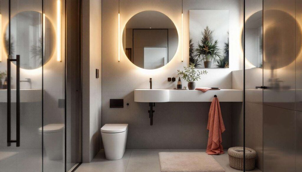
Small bathrooms present a unique decorating challenge, but the right colour palette can transform even the most compact washroom into an inviting retreat. Strategic colour choices not only influence the perceived size of a space but also set the mood and create visual interest. From soft pastels that open up tight quarters to bold accents that inject personality, understanding how different hues interact with light and space proves essential for maximising every square inch. Whether renovating a cramped en-suite or refreshing a bijou powder room, these seven colour approaches offer practical solutions for breathing new life into diminutive bathroom spaces whilst maintaining style and sophistication.
Choosing light colours to enlarge the space
Why pale shades create an illusion of spaciousness
Light colours reflect rather than absorb illumination, making walls appear to recede and creating the optical illusion of a larger area. Soft whites, creams, and pale greys work particularly well in bathrooms with limited natural light, as they bounce available light around the room. This reflective quality proves especially valuable in windowless bathrooms or those with only small openings, where maximising brightness becomes paramount for both functionality and atmosphere.
Practical application of light tones
Implementing a light colour scheme requires consideration of various elements:
- Ceiling paint in brilliant white to increase perceived height
- Wall colours in warm ivory or cool dove grey depending on lighting conditions
- Flooring in pale limestone or light wood-effect tiles for continuity
- Sanitaryware in classic white to maintain the airy aesthetic
Layering different shades of the same light colour family adds depth without compromising the spacious feel. A slightly darker tone on lower walls or behind fixtures provides subtle definition whilst maintaining overall brightness. Understanding how these foundational principles work prepares the ground for introducing more dynamic colour elements.
Opting for bright colour accents
Strategic placement of vibrant touches
Once a neutral base establishes visual expansion, carefully positioned pops of colour inject personality without overwhelming the space. Bright accents work best when applied to specific zones or accessories rather than entire walls, allowing for flexibility and preventing visual clutter in confined areas.
Effective accent colour applications
| Element | Colour suggestion | Impact |
|---|---|---|
| Towels and bath mats | Coral or sunshine yellow | Easily changeable warmth |
| Single feature wall | Terracotta or teal | Creates focal point |
| Cabinet doors | Sage green or powder blue | Adds character to storage |
| Tile borders | Mustard or ruby red | Defines architectural features |
The key lies in restraint: selecting one or two accent colours and repeating them throughout the space creates cohesion rather than chaos. This measured approach to colour introduction naturally leads towards exploring specific hues that offer particular benefits for bathroom environments.
Incorporating green for a natural touch
The psychological benefits of botanical hues
Green evokes nature and promotes relaxation, making it an ideal choice for spaces dedicated to personal care and rejuvenation. From soft mint to deep forest tones, this versatile colour family suits various design styles whilst maintaining a connection to the outdoors that proves particularly valuable in urban settings or bathrooms lacking garden views.
Implementing green effectively in small bathrooms
Lighter greens such as seafoam or pistachio work beautifully on walls, providing freshness without heaviness. Darker greens like emerald or hunter green suit feature walls or lower panelling, creating a grounding effect. Pairing green with natural materials enhances its organic quality:
- Wooden shelving or bamboo accessories complement sage tones
- Brass or gold fixtures create luxurious contrast against deep greens
- White marble or terrazzo flooring balances botanical wall colours
- Living plants in matching ceramic pots reinforce the natural theme
This botanical approach shares common ground with another colour family equally renowned for its soothing properties.
Playing with shades of blue for a calming ambience
Blue’s versatility across design styles
Blue remains the most universally calming colour, scientifically proven to lower blood pressure and reduce stress. In bathroom contexts, it naturally evokes water and cleanliness whilst offering remarkable flexibility across design aesthetics, from coastal cottage to contemporary minimalism.
Selecting the right blue tone
Pale blues such as powder or sky blue suit traditional and cottage-style bathrooms, creating an airy, fresh atmosphere. Mid-tone blues like cornflower or denim provide more presence without overwhelming compact spaces. Navy and midnight blue, whilst darker, can work exceptionally well when applied strategically:
- On a single wall behind a floating vanity to create depth
- In geometric tile patterns mixed with white for visual interest
- On lower wall sections with white above to maintain brightness
- In bathroom furniture pieces against pale walls
Pairing blue with crisp white sanitaryware and chrome fixtures creates a classic maritime aesthetic, whilst combining it with warm wood tones produces a more contemporary Scandinavian feel. This exploration of blue’s potential naturally raises questions about whether darker colours can ever work in restricted spaces.
Creating an elegant contrast with dark tones
Challenging conventional wisdom about small spaces
Contrary to popular belief, dark colours can actually make small bathrooms feel more intimate and luxurious rather than cramped. When applied thoughtfully, deep hues create a cocoon-like atmosphere that transforms a tiny bathroom into a jewel-box space. The key lies in balancing darkness with adequate lighting and reflective surfaces.
Successful strategies for dark bathroom colours
Implementing dark tones requires careful planning to avoid creating a cave-like effect. Charcoal grey, deep plum, or rich chocolate brown work particularly well when combined with specific design elements:
| Dark colour choice | Essential pairing | Lighting requirement |
|---|---|---|
| Charcoal grey | Large mirror and white fixtures | Multiple light sources |
| Navy blue | Brass accents and marble surfaces | Overhead plus task lighting |
| Forest green | Gold hardware and white ceiling | Wall sconces and natural light |
| Aubergine | Chrome fixtures and pale flooring | Recessed and accent lighting |
Glossy finishes on dark walls reflect light more effectively than matt surfaces, whilst keeping ceilings white maintains vertical spaciousness. This dramatic approach contrasts sharply with another sophisticated option that relies on tonal subtlety.
Emphasising monochrome for a cohesive look
The timeless appeal of single-colour schemes
Monochromatic palettes utilise various shades and tones of a single colour, creating visual harmony that makes spaces feel larger and more considered. This approach proves particularly effective in small bathrooms where too many competing colours can create visual fragmentation and make the space feel even more cramped.
Executing a successful monochrome bathroom
A monochrome scheme requires layering different values of the chosen colour to avoid flatness. For a grey monochrome bathroom, one might combine:
- Pale dove grey walls as the foundation
- Medium grey floor tiles with darker grey grouting
- Charcoal grey vanity unit for grounding weight
- Light grey textured towels for tactile interest
- Silver or chrome fixtures to complement the palette
Texture becomes crucial in monochrome schemes to prevent monotony. Combining glossy tiles with matt paint, smooth surfaces with textured fabrics, and reflective metals with natural stone creates depth through finish variation rather than colour contrast. Pattern also plays an important role: geometric tiles, striped towels, or patterned shower curtains in the same colour family add visual interest whilst maintaining cohesion.
Small bathrooms need not feel cramped or uninspiring when thoughtful colour choices guide the design process. Whether embracing light tones to maximise perceived space, introducing vibrant accents for personality, incorporating calming blues and greens, experimenting with dramatic dark shades, or committing to sophisticated monochrome schemes, each approach offers distinct advantages. The most successful small bathroom transformations occur when colour selection aligns with both practical lighting conditions and personal aesthetic preferences, proving that limited square footage need never limit style or impact.