


Interior design evolves at a remarkable pace, and what once dominated showrooms and design magazines can quickly fall out of favour. Paint colours, in particular, reflect shifting tastes and cultural movements. Designers are now steering clients away from certain hues that have saturated homes over recent years, favouring fresh palettes that better reflect contemporary sensibilities. Understanding which shades have lost their appeal can help homeowners make informed decisions when refreshing their spaces.
Shades of beige: an era over
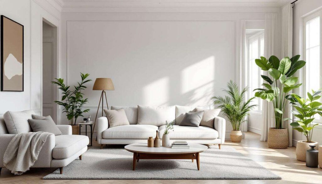
The dominance of neutral tones
For decades, beige has reigned supreme in interior design circles. Its versatility and perceived safety made it the default choice for walls, furnishings, and accessories. Homeowners embraced variations from greige to taupe, believing these neutral tones would provide timeless backdrops for any décor style. Estate agents championed beige as the colour most likely to appeal to potential buyers, cementing its position as the go-to shade for property staging.
Why designers are moving away
The ubiquity of beige has become its downfall. Design professionals now describe these shades as uninspiring and lacking personality. The modern approach favours bolder neutrals that add character without overwhelming spaces. Key reasons for abandoning beige include:
- Creates flat, lifeless environments that feel dated
- Fails to complement contemporary furniture designs
- Offers no visual interest or depth to interiors
- Associated with builder-grade, mass-market aesthetics
Contemporary alternatives
Designers recommend replacing beige with warmer terracotta tones, sophisticated greys with undertones, or even soft whites that reflect natural light beautifully. These alternatives provide the neutrality homeowners seek whilst introducing subtle complexity that elevates spaces beyond the mundane.
Whilst beige fades from favour, other colours that once seemed fresh and innovative are also experiencing declining popularity amongst design professionals.
The comeback of mint green: a misstep
The retro revival that missed the mark
Mint green enjoyed a resurgence as designers explored mid-century aesthetics and vintage-inspired palettes. This pastel shade appeared in kitchens, bathrooms, and accent walls, promising a cheerful yet sophisticated atmosphere. Retailers capitalised on the trend, producing everything from appliances to textiles in various mint iterations.
The limitations become apparent
Despite initial enthusiasm, mint green has proven problematic in practical applications. The colour often appears juvenile or overly sweet, particularly in larger doses. It clashes with many contemporary materials and finishes, creating discord rather than harmony. Furthermore, mint green dates spaces immediately, signalling a specific trend moment rather than timeless design.
| Design Issue | Impact on Spaces |
|---|---|
| Limited pairing options | Restricts furniture and accessory choices |
| Difficult lighting interactions | Appears sickly under certain bulbs |
| Trend-specific associations | Feels dated within months |
Designers now advocate for deeper, more complex greens that offer sophistication without the saccharine qualities that plague mint variations. These richer hues prove more versatile and enduring, qualities increasingly valued in residential design.
Navy blue loses its charm
From sophisticated to saturated
Navy blue emerged as the sophisticated alternative to black, offering depth and elegance whilst maintaining versatility. Design magazines featured navy accent walls, cabinetry, and entire rooms dedicated to this supposedly timeless shade. The colour promised to ground spaces whilst providing visual interest beyond standard neutrals.
Overexposure diminishes appeal
The widespread adoption of navy has rendered it predictable and uninspired. Every property seems to feature navy somewhere, from kitchen islands to bedroom feature walls. This oversaturation has stripped the colour of its special qualities, transforming it from a design statement into a tired cliché. Additionally, navy can make spaces feel smaller and darker than intended, particularly in homes with limited natural light.
Moving towards lighter blues
Design professionals now recommend exploring lighter, more nuanced blue tones that maintain sophistication without the heaviness associated with navy. Powder blues, slate blues, and blue-greys offer freshness whilst providing the calming qualities homeowners seek from blue palettes.
Just as navy’s popularity wanes, another colour that dominated social media feeds faces similar scrutiny from design experts.
Millennial pink: a waning affection
The social media phenomenon
Millennial pink became synonymous with Instagram-worthy interiors, appearing in cafés, boutiques, and homes worldwide. This dusty rose shade promised to add warmth and femininity without the intensity of traditional pinks. Brands embraced the colour, creating entire product lines dedicated to this particular hue.
The backlash builds
The colour’s association with a specific demographic and era has become problematic. Millennial pink now feels dated and overly trendy, marking spaces as belonging to a particular moment rather than exhibiting timeless design principles. The shade also presents practical challenges:
- Difficult to incorporate into diverse décor styles
- Can appear muddy or dull in certain lighting conditions
- Limits artwork and accessory options
- Feels exclusionary to those seeking gender-neutral spaces
Designers suggest exploring terracotta, rust, or peachy tones that provide warmth without the baggage associated with millennial pink.
Mustard yellow: the decline of a trend
The bold choice that overstayed
Mustard yellow represented daring design choices, offering vibrancy and personality to interiors. This retro-inspired shade appeared on accent walls, furniture pieces, and accessories, promising to energise spaces with its bold presence. Design enthusiasts embraced mustard as an antidote to safe, neutral palettes.
Why the colour fails
Mustard yellow proves challenging in practical applications. The shade can overwhelm spaces, creating visual fatigue rather than energising environments. It clashes with many other colours, limiting design flexibility. Moreover, mustard yellow often appears dingy or dirty rather than vibrant, particularly as paint ages or in rooms with poor lighting.
Contemporary designers favour clearer, brighter yellows or move towards warmer ochres that provide similar warmth without mustard’s problematic qualities.
Pastel tones: an outdated nostalgia
The appeal of softness
Pastel palettes promised gentle, calming environments that felt approachable and soothing. Soft lavenders, pale pinks, baby blues, and mint greens created spaces reminiscent of childhood or vintage aesthetics. These colours seemed safe and universally appealing, suitable for any room in the home.
The limitations of pale palettes
Pastels now feel insipid and lacking in substance. They create spaces that appear washed out and devoid of personality. Modern design emphasises authenticity and boldness, qualities that pastel tones simply cannot deliver. These shades also present maintenance challenges, showing dirt and wear more readily than deeper tones.
| Pastel Shade | Primary Issue | Recommended Alternative |
|---|---|---|
| Pale lavender | Appears cold and uninviting | Deep plum or mauve |
| Baby blue | Feels juvenile and dated | Slate or steel blue |
| Soft pink | Lacks sophistication | Terracotta or coral |
Embracing richer tones
Design professionals advocate for deeper, more saturated versions of traditional pastels. These richer tones provide visual interest whilst maintaining the calming qualities homeowners seek. Jewel tones, earthy hues, and complex neutrals offer the sophistication that contemporary interiors demand.
The paint colours falling from favour share common characteristics: oversaturation in the marketplace, limited versatility, and associations with specific trend moments. Moving away from these shades allows homeowners to create spaces that feel current and personal rather than derivative. Embracing deeper, more complex colours or exploring unexpected neutrals provides opportunities for genuine self-expression. Design evolves continuously, and staying informed about shifting preferences ensures homes remain fresh and appealing for years to come.