


The living room remains the heart of any home, where families gather and guests receive their first impressions of your interior design sensibilities. Selecting the right paint colour for this essential space requires careful consideration, as certain hues can dramatically alter the atmosphere and functionality of the room. Interior designers consistently warn against specific colour choices that may seem appealing initially but ultimately create unintended consequences for both the aesthetic appeal and practical use of your living space.
Mistakes to Avoid When Choosing Colours for Your Living Room
Understanding the Psychology of Colour Selection
Choosing paint colours without considering their psychological impact represents one of the most common errors homeowners make. Each shade influences mood, perceived temperature, and even the apparent size of your living room. Designers emphasise that impulsive decisions based solely on current trends or personal favourites often lead to regret once the paint dries and furniture returns to position.
Key Factors That Influence Colour Perception
Several elements affect how colours appear in your living room:
- Natural light availability and window orientation
- Artificial lighting types and placement
- Room dimensions and ceiling height
- Existing furniture and décor colours
- Adjacent room colour schemes
Professional decorators recommend testing paint samples on multiple walls and observing them at different times throughout the day before committing to a final choice. This approach prevents costly mistakes and ensures the selected colour complements your space under various lighting conditions.
Beyond these fundamental considerations, specific colour categories pose particular challenges that warrant detailed examination.
The Impact of Dark Colours on Space and Light
How Deep Shades Affect Room Dimensions
Dark colours such as charcoal grey, deep navy, or chocolate brown can dramatically reduce the perceived size of your living room. Whilst these sophisticated hues work beautifully in spacious, light-filled environments, they prove problematic in smaller or poorly lit spaces. The absorption of natural light creates a cave-like atmosphere that feels oppressive rather than cosy.
The Light Absorption Problem
| Colour Type | Light Reflection Rate | Suitable Room Size |
|---|---|---|
| Dark colours | 5-15% | Large rooms only |
| Medium tones | 30-50% | Medium to large |
| Light shades | 70-90% | All sizes |
Interior designers note that dark walls require significantly more artificial lighting to achieve comfortable illumination levels, increasing both installation costs and ongoing energy consumption. The visual weight of these colours can overwhelm furniture and artwork, making the entire space feel unbalanced and claustrophobic.
Equally problematic are colours that demand attention through their vibrancy rather than their depth.
Why Bold Colours Can Disrupt Visual Harmony
The Challenge of Bright, Saturated Hues
Vivid colours like electric yellow, bright orange, or intense lime green create immediate visual impact but rarely sustain long-term appeal in living rooms. These high-energy shades stimulate rather than relax, contradicting the primary function of a living space as a place for unwinding and conversation.
Coordination Difficulties with Furnishings
Bold wall colours severely limit your decorating options:
- Furniture selection becomes restricted to neutral tones
- Artwork and accessories compete rather than complement
- Seasonal décor changes prove nearly impossible
- Resale value may decrease due to niche appeal
Designers observe that clients who choose bold colours typically request repainting within eighteen months, as the initial excitement fades into visual fatigue. The constant stimulation these colours provide prevents the living room from serving as a calming retreat after demanding days.
Temperature perception presents another crucial consideration when selecting appropriate living room colours.
Cool Colours and the Uninviting Atmosphere
The Temperature Effect of Blue and Grey Tones
Whilst cool colours like icy blue, steel grey, or mint green appear refreshing in paint samples, they often create an unwelcoming environment in living rooms. These shades lower the perceived temperature of a space, making it feel physically colder and emotionally distant. Families report spending less time in rooms painted with predominantly cool palettes, gravitating instead towards warmer spaces.
Regional Considerations for Cool Colours
The suitability of cool colours depends heavily on climate and natural light exposure. North-facing living rooms in the UK already receive limited warm sunlight, and cool wall colours exacerbate this deficiency. The resulting atmosphere feels sterile and institutional rather than homely and inviting, particularly during winter months when natural warmth becomes especially valuable.
One particular colour family deserves special attention due to its unique psychological and physiological effects.
Shades of Red: when Their Intensity Becomes a Hindrance
Physiological Responses to Red Environments
Red stimulates the nervous system, increasing heart rate and blood pressure. Whilst accent walls in muted terracotta or dusty rose can add warmth, bright red or crimson walls create an agitated atmosphere unsuitable for relaxation. Designers consistently advise against red in living rooms where families gather for quiet evenings or entertaining guests.
Cultural and Psychological Associations
Red carries strong associations with:
- Urgency and alarm
- Aggression and confrontation
- Overstimulation and restlessness
- Appetite stimulation (better suited to dining areas)
The overwhelming presence of red walls dominates all other design elements, making thoughtful interior decoration nearly impossible. This colour demands constant attention, preventing the visual rest essential for comfortable living spaces.
Fortunately, reliable alternatives exist that avoid these common pitfalls whilst maintaining aesthetic appeal.
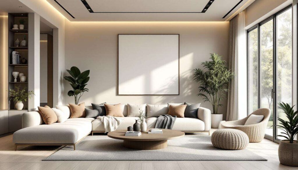
Neutral Colours: a Safer, timeless Option
The Enduring Appeal of Neutral Palettes
Neutral colours including warm whites, soft beiges, gentle greys, and subtle taupes provide versatile foundations for living room design. These shades enhance natural light, complement diverse furniture styles, and adapt easily to changing décor preferences. Interior designers favour neutrals for their longevity and flexibility, noting that clients rarely tire of these sophisticated choices.
Creating Interest Within Neutral Schemes
Neutral walls need not appear boring when combined with:
- Textured fabrics and layered textiles
- Statement furniture pieces in deeper tones
- Metallic accents and varied finishes
- Botanical elements and natural materials
- Carefully curated artwork and accessories
The subtle sophistication of neutral living rooms allows personality to emerge through furnishings and décor rather than permanent wall colours. This approach provides decorating freedom whilst maintaining a cohesive, polished appearance that appeals to both residents and potential buyers.
The colours you avoid in your living room prove just as important as those you embrace. By steering clear of dark, bold, cool, and intensely red shades, you create a welcoming foundation that enhances daily life whilst preserving design flexibility. Neutral palettes offer the perfect balance between aesthetic appeal and practical functionality, ensuring your living room remains a cherished gathering space for years to come.