


Choosing the right paint colour can transform any space, setting the mood and reflecting personal style. As we move forward, designers are embracing a palette that balances boldness with subtlety, bringing warmth, depth and character to interiors. From soothing blues to earthy terracottas, the latest trends offer something for every room and every taste. Whether you’re planning a complete renovation or simply refreshing a single wall, understanding these emerging shades will help you create spaces that feel both contemporary and timeless.
General colour trends in 2026
The design world is witnessing a shift towards nature-inspired hues that create harmony between indoor and outdoor environments. Designers are moving away from stark minimalism, favouring instead colours that evoke warmth, comfort and authenticity. This evolution reflects a growing desire for spaces that nurture well-being whilst maintaining aesthetic appeal.
The rise of earthy and organic tones
Natural pigments are dominating the colour conversation, with shades drawn from soil, stone and vegetation taking centre stage. These grounding colours create a sense of stability and connection to the natural world, making them ideal for homes seeking a tranquil atmosphere. Designers report increased demand for colours that feel lived-in and welcoming rather than overly polished or clinical.
Balancing bold and neutral
Contemporary interiors are embracing contrast by pairing statement colours with refined neutrals. This approach allows homeowners to experiment with vibrant shades without overwhelming their spaces. The key lies in strategic placement, using bold colours as focal points whilst maintaining balance through complementary neutral tones.
| Colour category | Emotional impact | Best suited for |
|---|---|---|
| Earthy tones | Grounding, calming | Bedrooms, living areas |
| Jewel tones | Luxurious, energising | Kitchens, dining rooms |
| Warm neutrals | Versatile, sophisticated | Studies, hallways |
These broader trends set the foundation for understanding how specific colours work within individual rooms, each bringing its unique character and purpose.
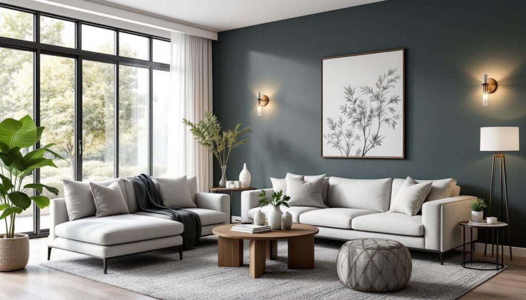
Shades of blue for the living room
Blue remains a perennial favourite for living spaces, but the shades gaining traction are far from traditional. Designers are championing complex blues that shift in different lighting conditions, creating dynamic and engaging environments.
From powder to midnight
The spectrum of blues currently popular ranges from soft powder shades to deep, saturated midnight tones. Lighter blues create an airy, expansive feel, particularly effective in smaller living rooms or spaces with limited natural light. Conversely, darker blues add drama and intimacy, perfect for larger rooms or evening entertaining areas.
- Powder blue: creates a serene, Scandinavian-inspired atmosphere
- Slate blue: offers sophistication with grey undertones
- Navy: provides depth whilst maintaining versatility
- Petrol blue: adds richness with green undertones
Pairing blue with complementary elements
To maximise the impact of blue walls, designers recommend incorporating natural materials such as oak furniture, linen textiles and brass fixtures. These elements prevent blue from feeling cold, instead creating a balanced and inviting living space. The key is layering textures and finishes that echo the colour’s depth.
Moving from the communal relaxation of the living room, kitchens require colours that stimulate creativity whilst maintaining a fresh, clean aesthetic.
Emerald green for the kitchen
Emerald green has emerged as a sophisticated alternative to traditional kitchen whites and greys. This jewel tone brings vitality and elegance, transforming kitchens into spaces that feel both energising and refined.
Why emerald works in culinary spaces
The psychological impact of green makes it particularly suited to kitchens. Associated with growth, freshness and renewal, emerald green creates an environment conducive to creativity and nourishment. Unlike brighter greens, emerald’s depth prevents it from feeling overwhelming, even in smaller kitchens.
Application techniques for maximum impact
Designers suggest several approaches for incorporating emerald green:
- Full cabinetry in emerald for a bold, cohesive look
- Accent wall behind open shelving or cooking areas
- Lower cabinets in emerald paired with neutral uppers
- Island units as a standalone statement piece
Pairing emerald with warm metallics such as brass or copper enhances its luxurious quality, whilst marble or light wood countertops provide essential contrast. The result is a kitchen that feels both contemporary and timeless.
From the energising atmosphere of the kitchen, bedrooms demand colours that promote rest and tranquillity.
Terracotta trend in bedrooms
Terracotta has evolved beyond its rustic associations to become a sophisticated bedroom choice. This warm, earthy shade creates cocoon-like spaces that encourage relaxation and restorative sleep.
The warmth factor
Unlike cooler neutrals, terracotta wraps rooms in comforting warmth, particularly valuable in bedrooms that receive limited natural light. Its clay-based origins give it an organic quality that resonates with the current desire for natural materials and sustainable design principles.
Styling terracotta bedrooms
To prevent terracotta from feeling heavy, designers recommend balancing it with lighter elements. Crisp white bedding, natural linen curtains and pale wood furniture create breathing space within the warmth. Incorporating textural variety through woven baskets, ceramic accessories and soft rugs enhances the tactile, comforting atmosphere.
| Terracotta shade | Best for | Complementary colours |
|---|---|---|
| Pale terracotta | Small bedrooms | Cream, soft grey |
| Mid-tone terracotta | Master bedrooms | White, natural wood |
| Deep terracotta | Accent walls | Charcoal, brass |
Whilst bedrooms embrace warmth, bathrooms are seeing unexpected colour choices that challenge conventional wisdom.
Mustard yellow, a bold choice for the bathroom
Mustard yellow represents a daring departure from traditional bathroom palettes, yet designers are increasingly advocating for this energising shade in spaces dedicated to self-care.
Breaking bathroom conventions
Bathrooms have long been dominated by whites, blues and greys, but mustard yellow offers a refreshing alternative that invigorates morning routines. Its golden undertones reflect light beautifully, making even windowless bathrooms feel brighter and more spacious.
Implementing mustard successfully
The key to using mustard yellow effectively lies in balance and proportion:
- Use on a single feature wall rather than all surfaces
- Pair with white sanitaryware for crisp contrast
- Incorporate black or dark grey fixtures for sophistication
- Add natural elements through wood or plants
Mustard yellow works particularly well in vintage-inspired bathrooms, complementing brass taps, traditional tiles and period features. However, it also suits contemporary spaces when paired with sleek, minimalist fixtures and geometric patterns.
From the energising qualities of bathroom yellows, studies require colours that enhance focus and productivity.
Revamped neutrals for the study
Neutrals have undergone significant evolution, moving beyond beige to encompass a sophisticated range of warm, complex shades perfect for home offices and studies.
The new neutral palette
Contemporary neutrals incorporate subtle undertones that add depth without distraction. Greige (grey-beige hybrids), warm taupes and soft clay shades create calm, focused environments conducive to concentration. These colours provide a backdrop that allows furniture, artwork and books to take centre stage whilst maintaining a cohesive, professional atmosphere.
Layering neutrals for interest
To prevent neutral studies from feeling bland, designers emphasise the importance of tonal variation. Using different shades of the same colour family on walls, woodwork and ceilings creates subtle dimension. Incorporating texture through linen blinds, wool rugs and leather desk accessories further enhances visual interest without introducing jarring colour contrasts.
- Warm grey: versatile and modern
- Mushroom: earthy with pink undertones
- Sand: light and airy
- Charcoal: sophisticated for accent walls
These revamped neutrals prove that understated doesn’t mean boring, offering timeless elegance that adapts to changing décor and personal tastes.
The paint colours gaining prominence reflect a broader movement towards interiors that prioritise comfort, authenticity and connection to nature. Whether opting for the calming depths of blue, the vitality of emerald green, the warmth of terracotta, the boldness of mustard yellow, or the sophistication of modern neutrals, each choice offers opportunities to create spaces that truly reflect individual style. The most successful interiors will be those that balance trend awareness with personal preference, creating homes that feel both current and enduringly personal.