

Yellow has long held a special place in the world of interior design, celebrated for its unique ability to lift spirits and transform even the darkest corners into welcoming sanctuaries. As designers continue to explore the psychological impact of colour on our daily lives, yellow emerges as a powerful tool for creating spaces that radiate warmth, energy and positivity. Whether you’re contemplating a complete room makeover or simply seeking to inject a dose of sunshine into your home, understanding the nuances of this versatile hue can make all the difference in achieving a space that truly brightens your days.
Trends in Yellow Interior Design
The Rising Popularity of Warm Tones
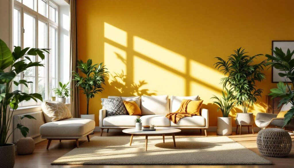
Contemporary interior design has witnessed a remarkable shift towards warmer colour palettes, with yellow taking centre stage in many residential projects. Design professionals increasingly recognise that incorporating sunny hues creates environments that foster optimism and well-being, particularly important in homes where natural light may be limited. This trend reflects a broader movement towards creating spaces that actively support mental health and emotional balance.
Yellow as a Versatile Design Element
The versatility of yellow allows it to function in multiple capacities within interior schemes:
- As a bold statement colour for feature walls that command attention
- In subtle applications through soft furnishings and accessories
- As a neutral alternative when selected in more muted tones
- For architectural details such as millwork and cabinetry
Design experts emphasise that yellow’s adaptability makes it suitable for virtually any room, from entryways that benefit from an immediate burst of energy to bedrooms where softer shades promote relaxation whilst maintaining brightness. Understanding how different intensities of yellow interact with lighting conditions and existing décor becomes essential for successful implementation.
Choosing the Perfect Shade of Yellow for Your Interior
Understanding Undertones and Intensity
Selecting the ideal yellow requires careful consideration of undertones and saturation levels. Yellow paint colours range from cool, lemony shades with green undertones to rich, golden hues that lean towards orange. The intensity of the colour significantly impacts how it transforms a space, with brighter yellows creating energetic atmospheres whilst softer variations offer gentle warmth without overwhelming the senses.
Matching Yellow to Room Function
Different spaces benefit from specific yellow tones based on their intended use:
| Room Type | Recommended Yellow Shade | Effect |
|---|---|---|
| Kitchen | Warm, saturated yellows | Creates inviting, sociable atmosphere |
| Bathroom | Soft, harmonious yellows | Promotes relaxation and cleanliness |
| Bedroom | Pastel or muted yellows | Balances energy with tranquillity |
| Entryway | Bright, welcoming yellows | Makes positive first impression |
Testing Before Committing
Professional designers consistently recommend testing paint samples in the actual space before making final decisions. Lighting conditions vary dramatically throughout the day, and a yellow that appears perfect in morning sunlight may transform entirely under evening artificial lighting. Applying test patches to multiple walls and observing them over several days ensures the chosen shade performs as desired in all conditions. Once you’ve identified the perfect yellow for your space, the next consideration becomes how to apply it with sophistication and style.
How to Incorporate Yellow in a Sophisticated Manner
The Art of Restraint
Sophisticated yellow applications often rely on strategic placement rather than overwhelming coverage. Design professionals suggest beginning with smaller commitments, such as a single accent wall or architectural features, before expanding to larger areas. This approach allows homeowners to experience the colour’s impact whilst maintaining flexibility in their overall design scheme.
Pairing Yellow with Complementary Colours
The sophistication of yellow often emerges through thoughtful colour combinations:
- Navy blue creates elegant contrast with earthy mustard tones
- Crisp white enhances the brightness of lighter yellows
- Grey provides a contemporary backdrop for vibrant yellow accents
- Natural wood tones complement warm, golden yellows beautifully
These pairings demonstrate that yellow need not stand alone to make an impact. When combined with darker or neutral colours, yellow becomes a sophisticated highlight that draws the eye without dominating the visual landscape. The key lies in balancing proportions and ensuring that yellow enhances rather than overwhelms the overall aesthetic.
Incorporating Yellow Through Finishes and Textures
Beyond wall colour, yellow can be introduced through various finishes and materials. Cabinetry painted in soft yellow hues brings warmth to kitchens without the commitment of full-wall coverage. Millwork elements in neutral yellow shades add architectural interest whilst maintaining a welcoming atmosphere. These applications demonstrate that sophistication often emerges from subtlety and thoughtful integration rather than bold statements. With these principles in mind, creating cohesive colour schemes becomes the natural next step.
Yellow Colour Schemes to Energise Your Home
Monochromatic Yellow Schemes
Working within a single colour family creates harmonious spaces with depth and interest. Monochromatic yellow schemes incorporate various shades from pale cream to rich golden tones, layered throughout a room to create visual complexity. This approach allows for energetic spaces that remain cohesive and intentional, with lighter yellows on walls complemented by deeper tones in furnishings and accessories.
Complementary and Analogous Combinations
Understanding colour theory enhances yellow’s effectiveness in home design:
- Complementary schemes pair yellow with purples for dramatic contrast
- Analogous combinations unite yellow with oranges and greens for natural harmony
- Triadic schemes incorporate yellow with red and blue for vibrant energy
- Split-complementary approaches use yellow with blue-violet and red-violet for sophisticated balance
Each approach offers distinct advantages depending on the desired atmosphere. Complementary schemes create dynamic spaces ideal for social areas, whilst analogous combinations suit rooms where relaxation remains paramount. The choice ultimately depends on personal preference and the specific mood you wish to cultivate in each space. These colour relationships provide frameworks for creating environments that truly energise daily life, leading naturally to specific shade recommendations from design professionals.
The Best Shades of Yellow according to Designers
Rich and Vibrant Options
Design experts consistently recommend certain yellow shades for their exceptional performance in residential settings. Imperial Chinese Yellow stands out as a bright, warm option that brings shine without overwhelming spaces. This rich yellow works particularly well in rooms requiring energy and vibrancy whilst maintaining sophistication through its depth and warmth.
For those seeking bright, welcoming tones, shades similar to Golden Square provide exceptional results in entryways and spaces lacking natural light. These yellows act as rays of sunshine, greeting visitors with warmth and creating positive first impressions that set the tone for the entire home.
Soft and Neutral Alternatives
Not all successful yellow applications require bold intensity. Softer options offer versatility and adaptability:
- Cream-based yellows provide warmth without overpowering existing décor
- Late Wheat tones work beautifully for millwork and cabinetry
- Weston Flax shades harmonise with existing tile work in bathrooms
- Pastel yellows create gentle, welcoming atmospheres in bedrooms
Statement-Making Mustards and Golds
For those willing to embrace bolder expressions, earthy mustard shades paired with navy blue create stunning living and dining rooms. These deeper yellows bring warmth and elegance, particularly effective in spaces where sophisticated contrast enhances the overall design. The richness of these tones allows them to function as focal points whilst remaining grounded and intentional rather than frivolous. Armed with knowledge of specific shades, implementing them effectively requires practical guidance.
Tips for Brightening Your Space with Yellow
Starting Small and Building Confidence
For those new to incorporating yellow, beginning with removable elements reduces risk whilst allowing experimentation. Cushions, artwork, and accessories in various yellow tones enable you to test colour responses before committing to permanent changes. This approach builds confidence and helps identify which shades resonate most strongly with your personal aesthetic preferences.
Maximising Natural and Artificial Light
Yellow’s effectiveness multiplies when paired with thoughtful lighting strategies:
- Position mirrors to reflect both natural light and yellow walls
- Select warm-toned light bulbs that enhance rather than compete with yellow
- Layer lighting sources to create depth and prevent flatness
- Consider how yellow appears under different lighting conditions throughout the day
These considerations ensure that yellow performs optimally regardless of external conditions. Spaces with limited natural light particularly benefit from strategic yellow applications, as the colour compensates for darkness whilst creating the illusion of sunshine even on the gloomiest days.
Balancing Yellow with Neutral Elements
Successful yellow interiors typically incorporate substantial neutral grounding to prevent visual fatigue. White trim, natural wood flooring, and neutral furnishings allow yellow to shine without overwhelming the senses. This balance creates spaces that energise without exhausting, maintaining their appeal over time rather than becoming tiresome. Professional designers emphasise that restraint often produces more impactful results than saturation, with yellow functioning best as a carefully considered element within a broader, cohesive design vision.
Yellow’s enduring appeal in interior design stems from its remarkable ability to transform atmospheres and elevate moods through carefully selected shades and thoughtful application. From rich, vibrant tones that command attention to soft, neutral variations that gently warm spaces, the spectrum of yellow offers solutions for every design challenge and personal preference. The key lies in understanding undertones, testing colours in actual lighting conditions, and balancing yellow with complementary elements that allow it to shine without overwhelming. Whether incorporated through bold feature walls, subtle millwork details, or strategic accessories, yellow remains an invaluable tool for creating homes that genuinely brighten even the darkest days whilst reflecting individual style and fostering genuine well-being.