


The kitchen has long been considered the heart of the home, a space where meals are prepared, conversations flow, and memories are created. Yet for decades, this vital room has often been cloaked in safe, neutral tones that prioritise practicality over personality. As we embrace a new era of interior design, the movement towards vibrant, mood-enhancing colours signals a fundamental shift in how we perceive and experience our cooking spaces. Colour psychology reveals that the hues surrounding us profoundly affect our emotional state, energy levels, and overall sense of well-being. By selecting the right palette for your kitchen, you can transform a purely functional area into a sanctuary of joy, warmth, and inspiration that elevates your daily culinary rituals.
New colour trends for your kitchen
The landscape of kitchen design is undergoing a remarkable transformation as homeowners and designers alike move away from the dominance of grey and beige towards more expressive and optimistic colour choices. This evolution reflects a broader cultural shift towards creating spaces that genuinely reflect personal identity and foster emotional connection.
The departure from neutral monotony
For years, kitchens have been characterised by safe, subdued palettes that prioritised resale value over personal expression. However, contemporary trends demonstrate a growing confidence in bold colour applications. Designers now advocate for kitchens that serve as canvases for creativity, where colour becomes a tool for self-expression rather than an afterthought. This shift acknowledges that the kitchen is not merely a utilitarian space but a living environment deserving of the same aesthetic consideration as any other room.
Emerging palette preferences
The colour trends gaining momentum showcase a diverse range of options:
- Lush green tones that evoke natural landscapes and bring the outdoors inside
- Warm yellows reminiscent of butter and sunshine that illuminate spaces
- Earthy terracotta shades that ground the space with warmth
- Deep forest greens that create intimate, enveloping atmospheres
- Sky blue hues that introduce tranquillity and openness
These colours represent a conscious departure from the clinical aesthetics that previously dominated kitchen design, embracing instead a philosophy that prioritises emotional resonance and psychological comfort.
Understanding these emerging trends provides the foundation for exploring how specific colours can fundamentally alter the mood and functionality of your cooking space.
Bright colours that transform the ambience
Bright, vibrant colours possess a unique ability to energise spaces and uplift spirits, making them particularly effective in kitchens where activity and social interaction naturally occur.
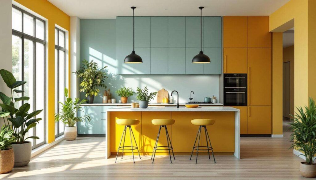
Butter yellow for radiant warmth
Butter yellow has emerged as a favoured choice for those seeking to inject sunshine and optimism into their kitchens. This particular shade strikes a delicate balance: warm enough to create cosiness yet light enough to maintain an airy feel. Unlike more intense yellows that can overwhelm, butter yellow provides a gentle luminosity that enhances natural light and makes spaces feel larger. It pairs exceptionally well with white cabinetry, natural wood elements, and metallic fixtures, creating a harmonious blend of traditional and contemporary aesthetics.
The energising effect of brick red
Brick red introduces a distinctive warmth and character that few other colours can match. This shade carries historical associations with traditional kitchens whilst remaining thoroughly modern in application. When used on cabinetry or as an accent wall, brick red creates focal points that draw the eye and anchor the design. The colour’s inherent warmth stimulates appetite and conversation, making it ideal for kitchens that serve as gathering spaces. Its versatility allows it to complement both rustic and contemporary design schemes.
Psychological benefits of vibrant hues
| Colour | Psychological Effect | Best Application |
|---|---|---|
| Butter Yellow | Increases optimism and mental clarity | Walls, cabinets, backsplash |
| Brick Red | Stimulates energy and appetite | Feature walls, lower cabinets |
| Coral | Promotes warmth and sociability | Accent pieces, accessories |
These bright colours work by stimulating the visual cortex in ways that trigger positive emotional responses, creating environments that naturally encourage activity, creativity, and social connection.
Whilst bright colours energise and invigorate, many homeowners also seek the grounding influence that natural tones provide.
The influence of natural tones in the kitchen
Natural tones draw inspiration from the earth itself, offering stability, warmth, and a profound sense of connection to the organic world that many modern interiors lack.
Lush green and its calming properties
Green tones, particularly those with blue undertones such as pistachio and sage, have gained significant traction in kitchen design. These shades evoke the tranquillity of natural landscapes whilst maintaining enough vibrancy to prevent spaces from feeling dull. Earth green creates a soft, calming atmosphere that reduces stress and promotes mindfulness during food preparation. The timeless quality of these greens ensures that they remain visually appealing long after installation, making them wise investments for those concerned with longevity.
Forest green for intimate gatherings
Forest green represents the deeper end of the natural spectrum, offering a richness that transforms kitchens into sophisticated, welcoming spaces. This shade possesses the unique quality of appearing almost black in low lighting whilst revealing its green character in brighter conditions. The depth of forest green creates an enveloping effect that makes large kitchens feel more intimate and small kitchens feel more substantial. When paired with brass or copper fixtures, natural wood, and warm lighting, forest green achieves a level of elegance that few colours can match.
Implementing natural tones effectively
- Use lighter greens on upper cabinets to maintain openness
- Apply darker forest tones to lower cabinets for grounding
- Incorporate natural materials like wood and stone to enhance organic feel
- Balance green tones with warm metallics to prevent coldness
- Consider the natural light available when selecting shade intensity
The connection between natural colours and psychological well-being is well-documented, with research indicating that exposure to nature-inspired hues reduces cortisol levels and promotes relaxation.
Beyond the grounding influence of greens, certain colours offer specific emotional benefits that deserve individual attention.
How sky blue brings serenity and happiness
Sky blue occupies a unique position in the colour spectrum, offering tranquillity without sacrificing cheerfulness, making it particularly effective in kitchen environments where both calm and energy are desired.
The psychology of blue in living spaces
Blue has long been associated with calmness, clarity, and openness. In kitchen applications, sky blue specifically evokes the expansiveness of clear skies, creating an illusion of greater space whilst maintaining a welcoming atmosphere. Unlike darker blues that can feel cold or formal, sky blue maintains warmth through its lighter tonality. This colour has been shown to lower blood pressure and heart rate, creating an environment conducive to mindful cooking and peaceful meal preparation.
Practical applications of sky blue
Sky blue works exceptionally well in various kitchen applications:
- Cabinet finishes that create focal points without overwhelming
- Wall colours that expand visual boundaries
- Tile work for backsplashes that add interest
- Painted ceilings that draw the eye upward
- Accent pieces such as bar stools or pendant lighting
Complementary colour pairings
| Sky Blue With | Effect Created | Ideal For |
|---|---|---|
| White | Fresh, clean, coastal | Contemporary kitchens |
| Natural wood | Organic, balanced, warm | Transitional spaces |
| Brass fixtures | Sophisticated, elegant | Traditional kitchens |
The versatility of sky blue allows it to adapt to numerous design styles whilst consistently delivering emotional benefits that enhance daily experiences.
Whilst blues offer serenity, warmer earth tones provide a different but equally valuable emotional impact.
Revitalise your space with shades of ochre and terracotta
Ochre and terracotta represent the warm, earthy end of the colour spectrum, bringing richness, depth, and a connection to traditional craftsmanship that resonates with contemporary desires for authenticity.
The timeless appeal of terracotta
Terracotta carries cultural and historical significance that adds layers of meaning to kitchen spaces. This warm, clay-inspired hue evokes Mediterranean landscapes, artisan pottery, and the comforting warmth of hearth and home. In kitchen applications, terracotta creates an immediate sense of cosiness whilst maintaining visual interest through its complex undertones. The colour works particularly well in kitchens with abundant natural light, where it can display its full range of warm orange and brown notes.
Ochre for golden warmth
Ochre offers a more muted alternative to bright yellows whilst maintaining their sunny disposition. This earthy yellow-brown brings a sophisticated warmth that feels both contemporary and timeless. Ochre has the remarkable ability to make spaces feel inhabited and loved, creating an instant sense of history and character even in newly designed kitchens. When used on cabinetry, ochre provides a neutral backdrop that allows other design elements to shine whilst contributing its own subtle warmth.
Strategic implementation of warm earth tones
- Apply terracotta to accent walls for dramatic focal points
- Use ochre on island cabinetry to create visual hierarchy
- Incorporate terracotta tiles for backsplashes with texture
- Select ochre-toned countertops for warmth underfoot
- Layer multiple earth tones for depth and complexity
These warm colours create environments that feel nurturing and grounding, essential qualities in spaces dedicated to nourishment and family connection.
Understanding these individual colours provides the foundation, but successful implementation requires thoughtful planning and execution.
Tips for incorporating soothing and warm colours
Successfully integrating mood-boosting colours into your kitchen requires strategic planning, balanced application, and attention to existing elements within the space.
Assess your space and lighting
Before committing to any colour, carefully evaluate your kitchen’s natural light conditions. North-facing kitchens benefit from warmer tones like ochre and terracotta that compensate for cooler natural light, whilst south-facing spaces can accommodate cooler blues and greens without feeling cold. Consider how artificial lighting affects colour perception during evening hours, as warm LED bulbs enhance warm colours whilst cool bulbs favour blues and greens.
Start with manageable applications
For those hesitant about bold colour commitments, begin with smaller, reversible applications:
- Paint a single accent wall rather than the entire room
- Update cabinet hardware in complementary metallic finishes
- Introduce colour through removable elements like curtains or rugs
- Test paint samples on large boards that can be moved around the space
- Incorporate colour through accessories before committing to permanent changes
Balance bold choices with neutrals
Even the most vibrant colours benefit from neutral anchors that prevent visual overwhelm. White countertops, natural wood flooring, and stainless steel appliances provide breathing room that allows colourful cabinetry or walls to shine without competing for attention. This balance ensures that the kitchen remains functional and timeless whilst expressing personality through colour.
Consider the 60-30-10 rule
| Percentage | Application | Example |
|---|---|---|
| 60% | Dominant colour | Wall colour, majority of cabinetry |
| 30% | Secondary colour | Island cabinets, flooring |
| 10% | Accent colour | Hardware, accessories, artwork |
This professional design principle ensures visual harmony whilst allowing for creative expression through multiple colours.
The transformative power of colour in kitchen design extends far beyond mere aesthetics, touching the very essence of how we experience our homes. By thoughtfully selecting hues that resonate with personal preferences whilst considering psychological impacts, homeowners can create cooking spaces that genuinely enhance daily life. Whether through the calming influence of sky blue, the energising warmth of butter yellow, the grounding effect of forest green, or the welcoming embrace of terracotta, each colour choice represents an opportunity to infuse joy into the heart of the home. The movement away from neutral monotony towards expressive, mood-boosting palettes reflects a broader understanding that our surroundings profoundly affect our well-being, making the kitchen not just a place for meal preparation but a sanctuary for happiness, connection, and creativity.