


Kitchen design continues to shift, with colour preferences evolving to reflect contemporary sensibilities and lifestyle changes. Interior designers are now steering homeowners away from certain hues that once dominated kitchen spaces, favouring instead a palette that emphasises warmth, subtlety, and timeless appeal. Understanding which colours to avoid and which to embrace can transform a kitchen from dated to distinctly modern.
Outdated colours to avoid in 2026
The decline of overly saturated shades
Certain colours that once felt fresh and innovative now appear tired and overused in kitchen environments. Bright, saturated blues that dominated kitchen cabinetry and accent walls have lost their appeal, with designers noting their tendency to overwhelm rather than enhance a space. Similarly, vivid greens in their most intense forms create visual fatigue rather than the refreshing atmosphere they once promised.
These bold choices, whilst initially striking, have proven difficult to live with over time. The intensity of these hues can make a kitchen feel smaller and less welcoming, particularly in homes with limited natural light. Designers now recommend moving towards more considered colour choices that offer longevity and versatility.
Why certain statement colours are losing ground
Deep navy tones, once considered sophisticated and elegant, have become ubiquitous to the point of predictability. What was once a distinctive choice has transformed into a safe default, stripping these shades of their original impact. The proliferation of navy cabinetry across residential and commercial spaces has diminished its capacity to make a meaningful design statement.
The shift away from these colours reflects a broader desire for individuality in interior spaces. Homeowners increasingly seek palettes that feel personal rather than following prescribed trends that quickly become commonplace.
Understanding these dated choices helps establish a foundation for exploring the alternatives that designers are now championing for contemporary kitchens.
Outdated kitchen colours according to designers
The problem with stark neutrals
While neutral palettes have long been considered safe choices, stark whites and cool greys are increasingly viewed as clinical and uninviting. These colours, when used without thoughtful layering or warm accents, create spaces that feel more institutional than residential. The popularity of these shades stemmed from their perceived versatility, yet their widespread adoption has resulted in kitchens that lack character and warmth.
- Pure white cabinetry paired with grey countertops creates a cold aesthetic
- Cool grey tones can make spaces feel unwelcoming and sterile
- These combinations often require extensive styling to feel lived-in
- Natural light variations can make these colours appear harsh or dull
The oversaturation of certain trendy hues
Beyond the primary colours falling from favour, designers point to specific shades that have become overexposed through social media and home improvement programming. Millennial pink and certain shades of mint have saturated the market to the point where they now signal a specific moment in time rather than timeless design. These colours, whilst charming in moderation, have been applied so extensively that they’ve lost their freshness.
| Dated Colour | Previous Appeal | Current Perception |
|---|---|---|
| Bright Turquoise | Energetic and fresh | Overpowering and dated |
| Deep Navy | Sophisticated statement | Predictable and common |
| Pure White | Clean and versatile | Sterile and cold |
Recognising these outdated choices naturally leads to exploring what designers are selecting as replacements, particularly for those who previously favoured green tones.
Trendy shades replacing green
Earthy green alternatives gaining prominence
Rather than abandoning green entirely, designers are gravitating towards muted, earthy iterations that feel grounded and organic. Olive, sage, and eucalyptus tones offer the connection to nature that brighter greens promised, but with greater sophistication and staying power. These shades work harmoniously with natural materials like wood and stone, creating cohesive environments that feel intentionally curated.
The appeal of these subdued greens lies in their versatility. They function equally well as dominant cabinet colours or as accent shades, and they complement both warm and cool undertones in surrounding materials. Unlike their brighter predecessors, these greens create calm rather than demanding attention.
Incorporating green thoughtfully
Contemporary approaches to green in kitchens emphasise restraint and balance. Rather than coating entire spaces in a single shade, designers recommend strategic application that allows the colour to enhance rather than dominate. This might involve using sage on lower cabinetry whilst keeping upper cabinets in warm neutrals, or introducing olive tones through backsplashes and accessories rather than major fixtures.
- Sage green cabinetry paired with brass hardware creates warmth
- Eucalyptus tones complement natural wood flooring
- Olive shades work beautifully with terracotta and clay accents
- These greens maintain appeal across seasons and lighting conditions
Just as green is being reconsidered, yellow tones are also undergoing significant transformation in kitchen design.
What tones to choose instead of yellow
Moving beyond bright yellows
Bright, cheerful yellows that once promised to energise kitchen spaces have proven difficult to live with long-term. Their intensity can feel jarring, particularly in the morning or under artificial lighting. Designers are instead recommending softer, more complex yellow-based hues that offer warmth without overwhelming the senses.
Warm creams and buttery tones provide the luminosity that yellow promised whilst maintaining sophistication. These colours work particularly well in kitchens with limited natural light, as they reflect available light without the harshness of pure white or the glare of bright yellow.
Terracotta and clay as yellow alternatives
Perhaps the most significant shift away from traditional yellow involves embracing terracotta and soft peach tones. These colours contain yellow undertones but are grounded by red and brown notes that create depth and warmth. They evoke Mediterranean and desert landscapes, bringing an organic quality to kitchen spaces that feels both contemporary and timeless.
| Traditional Yellow | Contemporary Alternative | Application |
|---|---|---|
| Bright lemon | Warm cream | Wall colour, upper cabinets |
| Sunshine yellow | Soft peach | Accent walls, backsplash |
| Golden yellow | Terracotta | Lower cabinets, accessories |
These warmer alternatives to traditional yellow naturally connect to the broader movement towards neutral hues that feel inviting rather than stark.
Adopting new neutral hues
The rise of warm neutrals
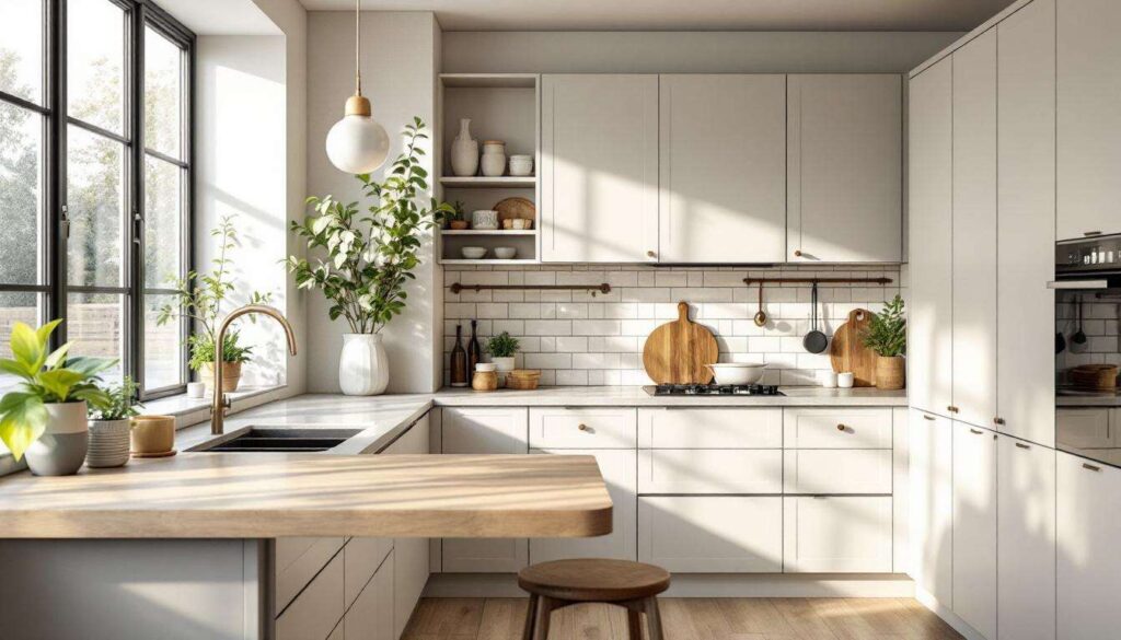
The neutral palette for kitchens is expanding beyond the stark whites and greys that have dominated recent years. Warm greiges, creamy whites, and soft browns are establishing themselves as the foundation colours for contemporary kitchens. These shades provide the versatility of traditional neutrals whilst introducing warmth that makes spaces feel inhabited and welcoming.
Greige, the sophisticated blend of grey and beige, offers particular appeal. It provides the modern sensibility of grey without the coldness, and the warmth of beige without appearing dated. This colour works exceptionally well as a base, allowing other elements like natural wood, metal fixtures, and carefully chosen accent colours to shine.
Layering neutrals for depth
Contemporary kitchen design emphasises the importance of layering multiple neutral tones to create visual interest and depth. Rather than selecting a single neutral and applying it uniformly, designers recommend combining several complementary shades to establish subtle variation throughout the space.
- Pair warm white upper cabinets with greige lower cabinets
- Introduce soft brown through wooden elements and shelving
- Use varying shades of cream in walls, backsplash, and countertops
- Layer textures within the neutral palette to prevent monotony
This nuanced approach to neutrals creates kitchens that feel sophisticated and intentional, setting the stage for understanding how these colours appear in practical applications.
Demonstrating modern kitchen colours
Practical application of contemporary palettes
Translating colour theory into functional kitchen spaces requires understanding how these hues perform under various conditions. Natural light significantly impacts colour perception, with north-facing kitchens benefiting from warmer tones that compensate for cooler natural light, whilst south-facing spaces can accommodate slightly cooler shades without feeling cold.
Designers recommend testing colours extensively before committing, observing how they appear at different times of day and under both natural and artificial lighting. This process reveals how colours interact with existing elements like flooring, countertops, and appliances, ensuring harmonious integration rather than jarring contrast.
Combining modern colours effectively
The most successful contemporary kitchens demonstrate thoughtful colour combinations that balance warmth, depth, and visual interest. Sage green cabinetry paired with warm cream walls and terracotta accessories exemplifies this approach, creating a palette that feels cohesive yet dynamic. Similarly, greige cabinets combined with natural wood elements and soft peach accents achieve sophistication without sterility.
| Primary Colour | Complementary Shade | Accent Tone |
|---|---|---|
| Sage green | Warm cream | Terracotta |
| Greige | Natural wood | Soft peach |
| Olive | Warm white | Clay brown |
Kitchen design in the coming years prioritises warmth, subtlety, and personal expression over bold statements that quickly date. By moving away from overly saturated blues and greens, deep navies, and stark neutrals, homeowners can embrace earthy greens, warm creams, terracotta tones, and sophisticated greiges that create inviting, timeless spaces. These contemporary palettes offer versatility and longevity, ensuring kitchens remain relevant and appealing well beyond immediate trends whilst reflecting individual taste and lifestyle preferences.