


Interior design is constantly evolving, and colour preferences shift with remarkable speed. What seemed fresh and modern just a few years ago can quickly appear dated as new trends emerge. Designers are now turning away from certain hues that dominated homes throughout the early 2020s, favouring palettes that feel more contemporary and sophisticated. Understanding which colours have fallen out of favour helps homeowners make informed decisions about their decorating schemes and avoid choices that may already look tired.
The end of the beige era
Why beige has lost its appeal
Beige dominated interiors for decades, prized for its neutral versatility and safe appearance. However, designers now view this once-beloved shade as uninspiring and lacklustre. The colour has become synonymous with bland, characterless spaces that fail to make any statement whatsoever.
The primary criticisms of beige include:
- Creates flat, one-dimensional spaces without visual interest
- Fails to complement modern furniture and fixtures
- Appears dull under contemporary lighting schemes
- Lacks the warmth that newer neutral alternatives provide
Contemporary alternatives to beige
Designers recommend replacing beige with warmer, more complex neutrals that add depth to interiors. Shades like warm taupe, greige with golden undertones, and soft terracotta offer the neutrality homeowners seek whilst providing significantly more character. These alternatives work beautifully with natural materials and contemporary design elements, creating spaces that feel both timeless and current.
The shift away from beige reflects a broader movement towards more intentional colour choices that enhance rather than simply fill space.
The false return of mint green
The brief resurgence that never materialised
Mint green experienced a momentary revival in recent years, with some designers predicting it would become the next major trend. However, this anticipated comeback has failed to gain lasting traction. The colour’s association with vintage aesthetics and retro kitchens has proven difficult to shake, making it feel more nostalgic than fresh.
| Year | Mint green popularity | Designer recommendation |
|---|---|---|
| 2023 | Rising interest | Cautious optimism |
| 2024 | Peak attention | Limited application |
| 2025 | Declining | Avoid entirely |
| 2026 | Outdated | Replace immediately |
Why mint green feels dated
The problem with mint green lies in its overly sweet quality and inability to work with contemporary colour schemes. It clashes with the earthy, grounded palettes currently favoured by designers and feels too juvenile for sophisticated interiors. The shade also tends to look artificial rather than natural, which conflicts with the current emphasis on organic, nature-inspired colours.
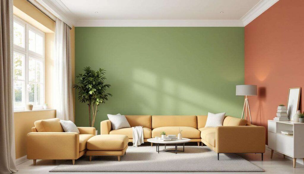
Designers suggest opting for deeper, more saturated greens like sage, olive, or forest green instead. These alternatives feel more grounded and versatile whilst still bringing the calming qualities associated with green hues.
The loss of popularity of navy blue
From classic to clichéd
Navy blue was once considered a foolproof choice for those seeking a sophisticated alternative to black or grey. It appeared in countless homes as an accent wall colour, kitchen cabinet finish, and bedroom shade. However, its ubiquity has led to fatigue amongst designers who now view it as predictable and overused.
The decline of navy blue can be attributed to:
- Overexposure in mainstream design magazines and television programmes
- Tendency to make rooms feel smaller and darker than necessary
- Difficulty in coordinating with emerging colour trends
- Association with corporate and nautical themes rather than residential warmth
Moving towards softer blues
Rather than abandoning blue entirely, designers recommend exploring lighter, more nuanced shades that feel less heavy. Powder blue, periwinkle, and dusty blue offer the calming qualities of blue without the weight and darkness of navy. These alternatives work particularly well in bedrooms and bathrooms where a serene atmosphere is desired.
The shift reflects a broader preference for colours that enhance natural light rather than absorb it, creating brighter, more uplifting interiors.
A disfavour for millennial pink
The rise and fall of a generation’s colour
Millennial pink dominated the latter half of the 2010s and early 2020s, appearing everywhere from fashion to interiors. This muted, dusty pink became so closely associated with a specific demographic and era that it now feels distinctly dated. Designers report that clients specifically request to avoid this shade, viewing it as emblematic of a trend that has firmly passed.
Why pink persists but millennial pink doesn’t
Interestingly, pink itself hasn’t fallen out of favour entirely. What designers reject is the specific dusty, greyish-pink that defined millennial pink. Brighter, clearer pinks or deeper rose tones remain acceptable in certain contexts. The issue lies with the particular shade’s oversaturation in the market and its inability to feel fresh or unexpected.
The rejection of millennial pink demonstrates how quickly colours tied to specific cultural moments can become outdated. What felt modern and Instagram-worthy just a few years ago now appears as a relic of a particular design era that has conclusively ended.
The decline of mustard yellow
From trendy accent to tired cliché
Mustard yellow enjoyed significant popularity as an accent colour in the late 2010s and early 2020s. It appeared on cushions, throws, accent chairs, and feature walls throughout homes seeking a pop of warm colour. However, designers now view this shade as having had its moment and moved firmly into outdated territory.
Challenges with mustard yellow include:
- Difficult to coordinate with other colours without appearing garish
- Can make spaces feel dated to a specific design period
- Often looks muddy or dull rather than vibrant
- Clashes with the current preference for clearer, brighter tones
Better yellow alternatives
For those seeking yellow’s cheerful energy, designers recommend opting for clearer, brighter yellows or softer, creamier tones. Butter yellow, whilst warm and inviting, should be used sparingly. Alternatively, golden yellows with more depth offer sophistication without the dated quality of mustard.
The key is selecting yellows that feel intentional and refined rather than trendy, ensuring they’ll remain appealing beyond current fashion cycles.
Outdated nostalgia for pastel tones
The pastel overload problem
Pastel colours experienced a significant resurgence in recent years, driven by nostalgia and a desire for softer, gentler interiors. However, the trend has reached saturation point. Designers now caution against pastel schemes, particularly when multiple pastel shades are combined, as they can create spaces that feel more like nurseries than sophisticated adult homes.
| Pastel shade | Previous use | Current status |
|---|---|---|
| Pastel pink | Bedrooms, bathrooms | Outdated |
| Pastel blue | Living rooms, nurseries | Outdated |
| Pastel lavender | Accent walls | Outdated |
| Pastel peach | Dining rooms | Outdated |
Moving beyond saccharine sweetness
The issue with pastels isn’t the lightness itself but rather the overly sweet quality they bring to spaces. Designers favour colours with more complexity and depth, even when working with lighter shades. Instead of pastel pink, consider blush with grey undertones. Rather than pastel blue, opt for powder blue with more pigment.
The contemporary approach involves selecting colours that feel sophisticated and grounded rather than whimsical. This doesn’t mean abandoning light colours entirely but rather choosing versions with more substance and character that can anchor a room rather than simply decorate it.
Understanding which colours have fallen out of favour allows homeowners to make choices that will remain appealing for years to come. The shift away from beige, mint green, navy blue, millennial pink, mustard yellow, and overly sweet pastels reflects a broader movement towards more intentional, sophisticated colour selections. By embracing warmer neutrals, complex tones, and colours with genuine depth, interiors can achieve a timeless quality that transcends fleeting trends whilst still feeling contemporary and fresh.