


Living rooms remain the heart of the home, where style meets comfort and personal expression takes centre stage. The colour choices we make for these spaces speak volumes about our desire for warmth, connection, and authenticity. Recent shifts in interior design preferences reveal a marked departure from the clinical coolness of previous years, embracing instead hues that ground us and create emotional resonance. From the calming embrace of nature-inspired greens to the unexpected boldness of rich, earthy browns, the palette for contemporary living spaces reflects a deeper yearning for environments that nurture rather than simply impress.
Green palette: soothing tones for the living room
The enduring appeal of nature-inspired hues
Green has firmly established itself as the most sought-after colour for living rooms, and its dominance shows no signs of waning. This preference stems from our innate connection to the natural world, with green evoking feelings of tranquillity, renewal, and balance. The shade’s versatility allows it to adapt to various design aesthetics, from minimalist Scandinavian interiors to maximalist bohemian spaces.
Navigating the spectrum of green shades
Selecting the perfect green requires careful consideration, as the spectrum ranges widely:
- Sage green offers a muted, sophisticated option that pairs beautifully with natural materials
- Forest green provides depth and drama, particularly effective as an accent wall
- Olive tones bring warmth whilst maintaining the colour’s earthy credentials
- Mint and lighter greens create airy, refreshing atmospheres in smaller spaces
The challenge lies in finding a shade that complements existing furnishings whilst achieving the desired mood. Earthy greens work exceptionally well alongside deep blues, creating layered, nature-inspired schemes that feel both grounded and sophisticated. For those seeking adventure, pairing green with unexpected accent colours like terracotta or ochre can produce stunning results.
This natural progression from green leads seamlessly into another colour family that shares its sophistication whilst offering a distinctly different emotional quality.
Trends in blue shades: elegance and sophistication
Deep blues as anchoring elements
Whilst not dominating the rankings as they once did, deep blue shades continue to hold significant appeal for those seeking refined, elegant living spaces. Navy, midnight blue, and rich teal tones provide a sense of depth and gravitas that lighter colours simply cannot achieve. These shades work particularly well in larger rooms with abundant natural light, where they create cocooning atmospheres without overwhelming the space.
Pairing blues with complementary tones
The most successful blue schemes rarely rely on the colour in isolation. Instead, designers are creating harmonious palettes by combining blues with:
- Warm neutrals like cream and beige to soften the cooler undertones
- Green accents that reinforce the nature-inspired aesthetic
- Metallic finishes in brass or gold that add warmth and luxury
- Natural wood tones that ground the scheme
The key to working with blue successfully lies in selecting shades with warmer undertones rather than the stark, cold blues of previous trends. This approach ensures the space feels inviting rather than austere, maintaining the colour’s sophistication whilst enhancing its livability.
Where blues bring coolness and calm, the next colour family offers something altogether warmer and more immediately welcoming.
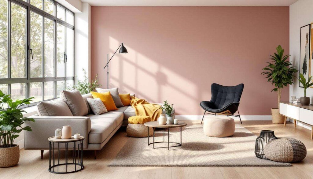
Neutral tones: beige and cream for a warm ambience
The evolution of neutral palettes
The neutral colour story has undergone a remarkable transformation, with stark greys and cool whites giving way to warmer, more nuanced options. Beige and cream have re-emerged as the foundation of choice for living rooms, but these are not the bland neutrals of decades past. Today’s iterations possess depth, complexity, and character, often incorporating subtle undertones of pink, yellow, or terracotta.
Soft clay neutrals leading the charge
Particularly popular are the soft clay neutrals, which draw inspiration from terracotta whilst maintaining a gentler presence. These shades offer numerous advantages:
| Characteristic | Benefit |
|---|---|
| Warmth | Creates immediately inviting atmospheres |
| Versatility | Pairs effortlessly with natural materials |
| Timelessness | Avoids the dated quality of cooler greys |
| Light reflection | Enhances natural light without harshness |
These neutrals work beautifully with natural materials like linen, wood, and rattan, creating layered, textured schemes that feel both sophisticated and relaxed. Pink-toned taupes have emerged as particularly soothing alternatives, offering just enough colour to create interest whilst maintaining the flexibility that neutrals provide.
This embrace of warmth extends beyond neutrals into more overtly colourful territory, particularly in shades that might have seemed unexpected just a few years ago.
Return of pinks: from raspberry pink to millennial pink
Pink’s unexpected renaissance
Pink has staged a remarkable comeback, shedding its traditionally gendered associations to become a sophisticated choice for contemporary living rooms. The spectrum ranges from the dusty, muted tones of millennial pink to deeper, more saturated raspberry and blush shades. This versatility allows pink to function both as a subtle accent and as a bold statement colour.
Incorporating pink with confidence
Successfully integrating pink requires understanding its various expressions:
- Millennial pink offers a barely-there blush that works as a neutral alternative
- Dusty rose provides vintage charm with modern sensibility
- Raspberry and deeper pinks create drama and personality
- Coral-leaning pinks bring energy whilst maintaining warmth
The key to working with pink lies in balancing its warmth with grounding elements. Pairing pink walls with natural wood furniture, or using pink as an accent against warm neutrals, prevents the colour from feeling overwhelming or saccharine. When combined with brass fixtures and velvet textures, pink achieves a level of luxury that feels both contemporary and timeless.
From the softer expressions of pink, we move into even richer, more grounded territory with the browns that anchor many of today’s most successful schemes.
Shades of brown: an umbra ground for a grounded and timeless look
Brown’s triumphant return
Perhaps no colour family better exemplifies the shift towards warmth than the resurgence of brown in all its variations. Once dismissed as outdated, brown has reclaimed its position as a sophisticated, grounding choice that brings instant warmth and character to living spaces. The shade known as walnut crunch has emerged as particularly significant, combining richness with approachability.
The versatility of brown tones
Brown’s appeal lies in its extraordinary range and adaptability:
- Rich chocolate browns create cosy, enveloping atmospheres
- Lighter caramel tones offer warmth without heaviness
- Walnut-inspired shades provide depth whilst remaining inviting
- Taupe-browns bridge the gap between traditional neutrals and bolder choices
These hues work particularly well in spaces designed for comfort and relaxation, making them ideal for living rooms where we gather with family and friends. Brown pairs beautifully with nearly every other trending colour, from greens and blues to pinks and ochres, providing a stable foundation that allows other elements to shine.
The warmth of browns sets the stage perfectly for exploring even deeper, more dramatic colour choices that push boundaries whilst maintaining sophistication.
Exploration of deep reds: wine red and aubergine take centre stage
Bold choices for confident spaces
For those seeking maximum impact, deep reds like wine and aubergine offer unparalleled drama and sophistication. These shades represent the boldest expression of the warm colour trend, creating spaces that feel luxurious, intimate, and decidedly grown-up. Whilst not for the faint-hearted, these colours reward confidence with rooms that possess genuine character and presence.
Working with deep reds successfully
Implementing these powerful shades requires careful planning:
| Consideration | Approach |
|---|---|
| Light levels | Best in well-lit rooms or as accent walls |
| Room size | Creates intimacy in larger spaces |
| Complementary colours | Pair with warm neutrals and metallics |
| Finish | Matte finishes prevent overwhelming richness |
Wine red and aubergine work exceptionally well when balanced with generous amounts of cream or beige, preventing the space from feeling too dark or oppressive. Ochre accents add brightness and sophistication, whilst metallic elements in gold or copper enhance the luxurious quality these colours naturally possess. The result is a living room that feels both dramatic and welcoming, a space with genuine personality that stands apart from more conservative choices.
The colour landscape for living rooms reflects a fundamental shift in how we approach our homes. Moving decisively away from the cool, minimalist palettes that dominated recent years, today’s preferences embrace warmth, comfort, and emotional connection. Green remains the undisputed leader, valued for its versatility and natural associations, whilst browns and warm neutrals provide the grounding that contemporary spaces require. Blues maintain their sophistication when chosen in deeper, warmer tones, and pinks have shed outdated associations to become genuinely chic options. For the bold, deep reds offer drama without sacrificing warmth. These choices collectively signal a desire for spaces that nurture rather than simply impress, creating living rooms that truly feel like home.