


Kitchen design continues to evolve as homeowners seek spaces that blend functionality with personal expression. The colour palette plays a crucial role in setting the mood and character of these essential rooms. From rich, grounding tones to sophisticated neutrals, the latest trends reflect a desire for authenticity and warmth. These emerging colour directions offer fresh perspectives on how we can transform our kitchens into inviting spaces that resonate with contemporary lifestyles whilst maintaining timeless appeal.
The resurgence of warm hues
Embracing comforting neutrals
The shift towards warm neutral tones marks a significant departure from the stark, clinical aesthetics that dominated previous years. Homeowners increasingly favour beiges, taupes, and soft terracottas that create a sense of comfort and relaxation. These colours work particularly well in open-plan living spaces where the kitchen flows seamlessly into dining and living areas.
- Warm beige tones that complement natural light
- Taupe shades offering versatility and sophistication
- Pale greens with yellow undertones creating freshness
- Creamy off-whites replacing stark bright whites
Textural elements enhancing warmth
The application of warm hues extends beyond simple paint colours. Textured surfaces such as V-groove panelling and subtly veined stone countertops add depth and interest without overwhelming the space. These materials catch light differently throughout the day, creating dynamic visual experiences that keep the kitchen feeling alive and engaging. The combination of warm colours with tactile surfaces produces environments that feel genuinely welcoming rather than merely styled.
| Warm Tone | Best Application | Pairing Material |
|---|---|---|
| Beige | Cabinetry | Oak wood |
| Taupe | Walls | Brass fixtures |
| Terracotta | Accent features | Natural stone |
This movement towards warmer palettes naturally leads to considerations of how colours can work together to create visual interest and depth.
Play of patterns and contrasts
Strategic colour blocking
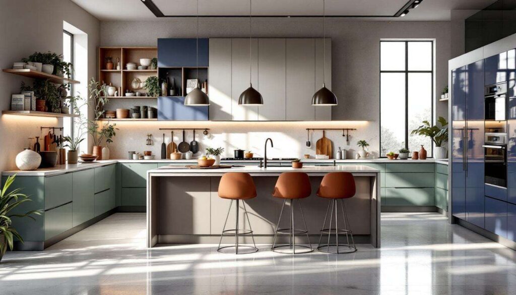
The concept of curated chaos introduces deliberate contrast into kitchen design. Rather than maintaining uniformity, designers now encourage the use of unexpected colour combinations to define different zones within the space. This approach allows homeowners to inject personality whilst maintaining functional clarity. A bold burgundy island paired with sage green cabinetry, for instance, creates visual drama whilst serving practical purposes.
Mixing materials for dynamic effects
Contrasts extend beyond colour alone. The juxtaposition of different textures and finishes creates layers of visual interest. Matte surfaces against polished metals, smooth porcelain alongside rough-hewn wood, and glossy tiles paired with chalky painted finishes all contribute to a richly textured environment. These material contrasts prevent monotony and allow individual elements to shine without competing for attention.
- Combining matte black hardware with warm wood tones
- Pairing smooth quartz with textured tile backsplashes
- Mixing painted and natural wood finishes
- Contrasting light upper cabinets with darker base units
These bold contrasts set the stage for exploring how historical influences shape contemporary colour choices.
Retro elegance with bold shades
Revisiting mid-century palettes
The influence of retro aesthetics brings sophisticated colour choices that feel both nostalgic and fresh. Deep burgundies, burnt oranges, and mustard yellows recall the confident colour use of past decades whilst being reinterpreted through modern design sensibilities. These shades work particularly well as accent colours, adding warmth and character without overwhelming the space.
Statement-making colour applications
Bold shades find their place in strategic applications rather than total coverage. A single wall painted in a rich terracotta, a set of lower cabinets in deep teal, or a splashback in vibrant ochre can transform a kitchen’s atmosphere. These confident colour choices demonstrate a shift away from playing it safe towards embracing personal expression and individuality in home design.
| Retro Shade | Intensity Level | Recommended Use |
|---|---|---|
| Burgundy | High | Feature island |
| Mustard | Medium | Accent wall |
| Burnt Orange | Medium-High | Lower cabinetry |
The embrace of bold historical colours connects naturally with the growing appreciation for organic elements in kitchen design.
Influence of natural materials
Authentic surfaces with character
The trend towards natural materials reflects a desire for authenticity and connection to the physical world. Unlacquered brass, solid wood, and natural stone are prized for their ability to develop patina over time, telling the story of the kitchen’s use and the family’s life. These materials bring inherent colour variations that add depth and interest impossible to achieve with manufactured alternatives.
- Unlacquered brass developing rich golden tones
- Solid oak aging to deeper amber hues
- Natural stone displaying unique veining patterns
- Copper elements acquiring verdigris patina
Colour inspiration from nature
Natural materials don’t merely provide texture; they also inform colour choices throughout the space. The warm honey tones of oak, the grey-greens of soapstone, and the warm whites of limestone inspire complementary paint and finish selections. This nature-derived palette creates harmonious environments that feel grounded and cohesive, with colours that work together because they originate from the same organic sources.
This connection to natural materials flows seamlessly into the broader trend of earth-inspired colour palettes.
Trend of earthy pastel colours
Sophisticated soft tones
Earthy pastels represent a refined evolution of traditional pastel shades. Rather than sweet, candy-like colours, these tones incorporate grey or brown undertones that give them substance and sophistication. Dusty sage, muted terracotta, and soft clay colours create calming environments whilst maintaining visual interest and depth.
Layering subtle shades
The beauty of earthy pastels lies in their versatility and ability to layer. Multiple shades from the same tonal family can coexist harmoniously, creating depth without contrast. A kitchen might feature pale sage walls, slightly deeper sage-grey cabinetry, and stone countertops with green-grey veining, all working together to produce a cohesive, tranquil atmosphere.
| Earthy Pastel | Undertone | Mood Created |
|---|---|---|
| Dusty Sage | Grey-green | Calming |
| Soft Clay | Pink-brown | Warming |
| Pale Olive | Yellow-green | Fresh |
These gentle earth tones provide an ideal backdrop for exploring the dramatic potential of darker wood elements.
Focus on dark wood tones
Rich timber making statements
The incorporation of dark wood tones adds gravitas and sophistication to kitchen spaces. Walnut, dark oak, and stained timber bring depth and warmth whilst grounding lighter elements. These woods work particularly well in contemporary settings where their natural beauty can be appreciated without competing with excessive ornamentation.
- Walnut cabinetry providing rich chocolate tones
- Dark-stained oak offering depth and texture
- Ebonised timber creating dramatic contrast
- Smoked wood finishes adding subtle sophistication
Balancing darkness with light
Successfully incorporating dark wood requires thoughtful balance. These rich tones work best when paired with lighter elements that prevent the space from feeling heavy or oppressive. Pale stone countertops, white or cream walls, and ample natural light ensure that dark wood adds sophistication rather than gloom. The interplay between dark timber and lighter surroundings creates dynamic visual interest that elevates the entire space.
The kitchen colour landscape reflects a broader shift towards authenticity, warmth, and personal expression. From the embrace of comforting warm neutrals to the sophisticated use of dark woods, these trends prioritise creating spaces that feel genuinely lived-in and welcoming. The movement away from stark minimalism towards richer, more textured environments demonstrates a collective desire for kitchens that serve as true hearts of the home. Whether through bold retro shades, earthy pastels, or the natural patina of authentic materials, these colour directions offer numerous pathways to creating kitchens that balance aesthetic appeal with practical functionality and emotional resonance.