


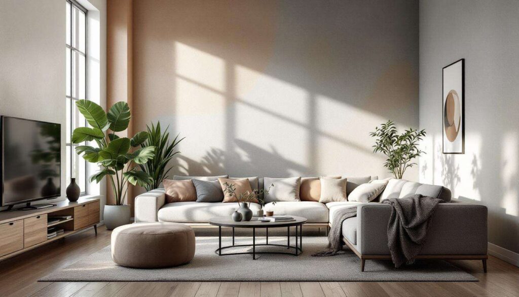
Designers are witnessing a fascinating shift in interior aesthetics as paint colour preferences evolve beyond stark whites and cool greys. The palette emerging for home interiors embraces warmth, depth, and versatility whilst maintaining the understated elegance that homeowners crave. These hues offer the perfect balance between personality and restraint, creating spaces that feel both contemporary and enduring. From earthy undertones to muted pastels, the latest colour trends demonstrate that neutrality need not equate to blandness, but rather to sophisticated subtlety that complements diverse design styles.
Trending colours of 2026: the revival of neutrals
Understanding the new neutral philosophy
The concept of neutral paint colours has undergone a remarkable transformation. Where once neutrals meant variations of white, cream, and grey, today’s interpretation encompasses a broader spectrum of understated yet characterful shades. Interior designers are championing colours that possess depth and warmth whilst retaining the versatility that makes neutrals so appealing for long-term decorating schemes.
These emerging neutrals share several defining characteristics:
- Complex undertones that shift with natural light throughout the day
- Warm bases that create inviting atmospheres rather than clinical spaces
- Compatibility with various design styles from minimalist to maximalist
- Ability to serve as both backdrop and statement depending on application
- Timeless appeal that transcends seasonal trends
Why designers are embracing warmer palettes
The shift towards warmer neutral tones reflects changing attitudes about home environments. After years of cool, minimalist interiors, homeowners are seeking spaces that feel nurturing and grounded. Designers report that clients increasingly request colours that add emotional warmth without overwhelming sensory experiences. This preference aligns with broader wellness trends emphasising comfort and connection to natural elements within living spaces.
| Colour Category | Primary Appeal | Best Applications |
|---|---|---|
| Warm beiges | Versatility and sophistication | Living rooms, hallways |
| Soft blues | Calming properties | Bedrooms, bathrooms |
| Terracotta tones | Earthy warmth | Dining areas, accent walls |
| Sage greens | Natural connection | Kitchens, home offices |
| Pearl greys | Timeless elegance | Any room, trim work |
This evolution in colour preferences sets the stage for examining specific hues that exemplify the new neutral aesthetic, beginning with the sophisticated resurgence of beige.
The return of modern beige
Beige reimagined for contemporary interiors
Beige has shed its reputation as boring and predictable, emerging as a sophisticated foundation colour for modern homes. Today’s beiges differ markedly from their predecessors, featuring complex undertones that range from greige (grey-beige hybrids) to warmer taupes with pink or peach influences. These nuanced variations allow designers to create layered, textured spaces that feel both current and classic.
Contemporary beige shades offer remarkable flexibility in design applications. They pair beautifully with natural materials such as oak flooring, linen textiles, and stone surfaces whilst providing an ideal backdrop for bolder accent colours. The warmth inherent in modern beige formulations prevents spaces from feeling sterile, instead creating environments that feel welcoming and lived-in from the outset.
Implementing beige effectively
Successful use of beige requires attention to undertone compatibility throughout a space. Designers recommend testing paint samples in various lighting conditions, as beige can appear dramatically different under natural daylight versus artificial evening illumination. Consider these strategies:
- Layer multiple beige tones for depth rather than using a single shade throughout
- Combine beige walls with white trim for crisp definition
- Introduce texture through furnishings to prevent monotony
- Balance warm beiges with cooler accent elements for visual interest
- Use darker beige tones on lower walls or wainscoting for grounding effect
The versatility of beige naturally leads to exploring another calming colour family that offers similar neutrality with a distinctly different character.
Soothing with soft blues
The calming influence of muted blue tones
Soft blue shades have earned their place among the new neutrals through their remarkable ability to create serene environments whilst maintaining visual interest. Unlike bold navy or bright turquoise, these whisper-soft blues feature significant grey or white content that renders them surprisingly versatile. Designers appreciate how these hues evoke sky and water without overwhelming spaces with colour intensity.
The psychological benefits of soft blue tones make them particularly suitable for bedrooms, bathrooms, and spaces designated for relaxation. Research consistently demonstrates that blue environments can lower blood pressure and heart rate, promoting restful states. Modern formulations avoid the coldness sometimes associated with blue by incorporating warmer undertones that prevent spaces from feeling unwelcoming.
Pairing soft blues with complementary elements
Creating cohesive schemes with soft blue walls requires thoughtful consideration of accompanying colours and materials. These blues work exceptionally well with:
- Natural wood tones, particularly lighter oaks and bleached finishes
- Crisp white linens and soft grey textiles for layered neutrality
- Brass or gold metallic accents that add warmth without competing
- Terracotta or rust accessories that provide earthy contrast
- Sage green plants and botanical elements for natural harmony
The tranquil nature of soft blues provides an interesting counterpoint to the next trending neutral, which draws inspiration from earthier sources.
The warmth of terracotta tones
Embracing earthy sophistication
Terracotta-inspired paint colours represent a bold yet grounded approach to neutral decorating. These warm, clay-based hues range from pale peachy tones to deeper rust shades, all sharing an inherent earthiness that connects interiors to natural landscapes. Designers are increasingly specifying these colours for clients seeking warmth and character without resorting to traditional wood panelling or wallpaper.
The appeal of terracotta tones lies in their ability to make spaces feel instantly welcoming and established. Unlike cooler neutrals that can feel somewhat aloof, these warm shades create immediate intimacy. They work particularly well in dining areas where conviviality is desired, and in living spaces that serve as gathering points for family and friends.
Balancing intensity in terracotta schemes
Successfully incorporating terracotta paint colours requires careful attention to proportion and balance. Consider these approaches:
- Use deeper terracotta shades on single accent walls rather than entire rooms
- Pair with abundant white trim and ceiling paint to prevent overwhelming warmth
- Introduce cooling elements through blue or green accessories
- Select lighter terracotta tones for smaller spaces to maintain airiness
- Combine with natural materials like rattan and jute for cohesive earthiness
| Terracotta Intensity | Recommended Room Size | Ideal Lighting |
|---|---|---|
| Pale peach-terracotta | Small to medium | North-facing rooms |
| Medium clay tones | Medium to large | East or west-facing |
| Deep rust-terracotta | Large, high-ceilinged | South-facing rooms |
The earthy warmth of terracotta finds a complementary counterpart in another nature-inspired neutral that brings freshness to interior spaces.
The subtle brilliance of sage greens
Nature-inspired neutrality
Sage green has emerged as a remarkably versatile neutral that bridges the gap between colour and subtlety. These muted green-grey hybrids possess an organic quality that brings the outdoors inside whilst maintaining the restraint expected of neutral palettes. Designers value sage tones for their ability to complement both warm and cool colour schemes, making them exceptionally adaptable across various design contexts.
The popularity of sage green reflects broader biophilic design trends emphasising connection to natural environments. These colours evoke moss, eucalyptus, and weathered stone, creating spaces that feel inherently calming and restorative. Unlike brighter greens that can feel juvenile or overwhelming, sage maintains sophistication suitable for adult living spaces.
Creating harmony with sage green walls
Maximising the potential of sage green paint involves understanding its chameleon-like qualities. These shades can appear more grey in low light and more green in bright conditions, requiring careful consideration of room orientation and lighting. Effective implementation strategies include:
- Pairing with warm wood tones to enhance the colour’s green qualities
- Combining with white or cream for fresh, airy schemes
- Introducing terracotta or rust accents for earthy depth
- Using in kitchens alongside natural stone and brass fixtures
- Layering with deeper forest greens in textiles for tonal richness
The natural freshness of sage green provides an excellent segue to examining a final neutral that offers timeless sophistication.
The timeless charm of pearl greys
Sophisticated simplicity
Pearl grey represents the refined evolution of traditional grey paint colours. Unlike stark, cool greys that dominated interiors in recent years, pearl greys incorporate subtle warm undertones that prevent spaces from feeling cold or institutional. These luminous shades possess a gentle reflective quality that enhances natural light whilst maintaining the understated elegance that makes grey perpetually popular.
Designers appreciate pearl grey for its exceptional versatility across architectural styles and room functions. It serves equally well as a backdrop for minimalist schemes and as a sophisticated foundation for more ornate decorating approaches. The warmth inherent in pearl grey formulations ensures compatibility with various wood tones, metal finishes, and textile colours.
Maximising pearl grey’s potential
Achieving optimal results with pearl grey walls requires attention to complementary elements and lighting considerations:
- Layer multiple grey tones for depth rather than monotone application
- Pair with bright white trim for crisp architectural definition
- Introduce warm metallics like brass or copper for luxurious contrast
- Combine with soft blues or sage greens for subtle colour interest
- Use in rooms with ample natural light to showcase the pearl-like lustre
Pearl grey’s adaptability makes it suitable for entire home schemes, providing continuity whilst allowing individual rooms to develop distinct personalities through furnishings and accessories.
The evolving definition of neutral paint colours reflects a broader shift towards interiors that balance restraint with warmth and personality. These eight trending hues demonstrate that neutrality encompasses far more than whites and cool greys, offering homeowners sophisticated options that create welcoming, enduring spaces. From the reimagined elegance of modern beige to the luminous sophistication of pearl grey, these colours provide versatile foundations for diverse design visions. By embracing warmer undertones and nature-inspired palettes, these new neutrals ensure that homes feel both contemporary and timeless, adapting gracefully to changing furnishings and evolving personal tastes whilst maintaining their fundamental appeal.