


Interior designers have witnessed countless trends come and go, but few decades provoke as much debate as the 1970s. Whilst some elements of this era have enjoyed a nostalgic revival, others remain firmly locked in the past for good reason. Beyond the infamous bathroom carpeting that has become a symbol of questionable design choices, several other trends from this period continue to make professionals cringe. Understanding why these particular aesthetics fell out of favour offers valuable insight into how our tastes evolve and what makes timeless design truly endure.
The return of psychedelic prints
The overwhelming visual impact of bold patterns
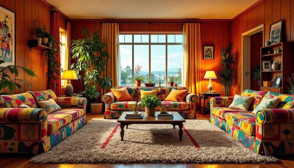
Psychedelic prints defined much of 1970s interior design, with swirling patterns and kaleidoscopic motifs adorning everything from wallpaper to upholstery. These designs, inspired by the counterculture movement, featured abstract shapes that seemed to move across surfaces. Designers today express concern about the visual chaos these patterns create, making spaces feel cluttered and overwhelming rather than harmonious.
The primary issues with psychedelic prints include:
- They dominate a room’s aesthetic, leaving little space for other design elements
- The busy patterns can trigger visual fatigue and headaches
- They clash with nearly all contemporary furniture styles
- The prints date a space immediately, making it feel trapped in time
- They reduce the perceived size of rooms by creating visual noise
Why modern sensibilities reject these patterns
Contemporary design philosophy emphasises calm, curated spaces that promote wellbeing and relaxation. Psychedelic prints work against this principle by stimulating rather than soothing. Interior designers note that whilst accent pieces with bold patterns can add interest, covering entire walls or large furniture items creates an environment that feels more like a theme park than a home. The shift towards minimalism and Scandinavian-inspired interiors has made these aggressive patterns particularly jarring to modern eyes.
| Design element | 1970s approach | Modern preference |
|---|---|---|
| Pattern intensity | Maximum coverage | Strategic accents |
| Colour palette | Multiple clashing hues | Cohesive schemes |
| Visual balance | Stimulation-focused | Calm-focused |
Whilst psychedelic patterns assault the senses through their complexity, the decade’s approach to colour proved equally problematic in different ways.
The dominance of garish colours
Avocado, harvest gold, and burnt orange everywhere
The 1970s embraced a palette that contemporary designers describe as aggressively dated. Avocado green, harvest gold, and burnt orange appeared not just as accent colours but as the primary hues for major fixtures and appliances. Kitchen appliances, bathroom suites, and carpeting all came in these shades, creating spaces that felt heavy and oppressive rather than fresh and inviting.
These colours presented several practical problems:
- They made spaces feel darker and smaller
- The shades aged poorly, often appearing muddy or dull
- Matching or coordinating with these colours proved nearly impossible
- They absorbed rather than reflected light
- The colours became synonymous with outdated design
The psychological impact of colour choices
Modern colour psychology reveals why these 1970s favourites feel so uncomfortable. Harvest gold and similar warm, murky tones can create feelings of stagnation rather than energy. Unlike the vibrant, clear colours popular today, these muddy shades lack the vitality that makes a space feel alive. Designers now understand that colour temperature and saturation significantly affect mood, and the 1970s palette consistently chose combinations that felt oppressive rather than uplifting.
These problematic colour choices often appeared on surfaces and furniture that compounded their negative impact.
Formica furniture: an outdated icon
The ubiquity of laminate surfaces
Formica and similar laminates dominated 1970s furniture design, appearing on dining tables, kitchen counters, and even decorative pieces. Whilst the material offered practical benefits such as easy cleaning and durability, the aesthetic result felt cheap and artificial. The shiny, plastic appearance of these surfaces, often in those same garish colours, created interiors that lacked warmth and authenticity.
Why natural materials have reclaimed popularity
The contemporary movement towards sustainable, natural materials represents a direct rejection of the Formica era. Today’s designers prioritise wood, stone, and other materials that age gracefully and develop character over time. The shift reflects broader values:
- Environmental consciousness favouring renewable resources
- Appreciation for craftsmanship and authenticity
- Desire for materials that improve with age
- Recognition that natural textures create warmth
- Understanding that quality materials represent better long-term value
| Material characteristic | Formica approach | Natural materials |
|---|---|---|
| Ageing process | Degrades, chips, yellows | Develops patina |
| Environmental impact | Petroleum-based | Renewable resources |
| Tactile quality | Cold, artificial | Warm, organic |
| Aesthetic perception | Cheap, dated | Timeless, valuable |
Artificial surfaces weren’t the only problematic material choice, as the decade’s approach to wood treatments proved equally troublesome.
Dark wood wall panelling
The cave-like atmosphere of panelled rooms
Dark wood panelling covered walls in countless 1970s homes, creating what designers now describe as oppressively dim spaces. Typically installed floor to ceiling, this panelling absorbed light and made rooms feel significantly smaller. The heavy, masculine aesthetic dominated living rooms, dining rooms, and especially basements, which often resembled caves more than habitable spaces.
The challenges of removing and updating panelled spaces
Homeowners today face significant challenges when dealing with this legacy. The panelling often hides damaged walls, making removal expensive and time-consuming. Even when painted, the grooves and texture remain visible, creating a persistent reminder of the original installation. Modern design emphasises light, airy spaces that feel open and connected, making dark panelling particularly problematic.
Key issues with wood panelling include:
- Significant light absorption reducing room brightness
- Visual weight making spaces feel cramped
- Difficulty in creating cohesive colour schemes
- The texture collecting dust and appearing dated
- Incompatibility with contemporary furniture and décor
This preference for dark, heavy treatments extended beyond walls into other crucial areas of the home.
Monochrome kitchens: a dated choice
The all-in-one colour scheme approach
The 1970s kitchen often featured total colour coordination, with cabinets, appliances, countertops, and even flooring all in matching or tonal shades. Whilst this created a unified look, the result felt sterile and institutional rather than warm and inviting. Avocado kitchens or harvest gold schemes dominated, with every surface reflecting the same oppressive hue.
Why layered, varied palettes work better
Contemporary kitchen design embraces visual depth through varied materials and complementary colours. Designers now understand that successful spaces require contrast and interest. Modern kitchens typically feature:
- Mixed materials creating textural interest
- Contrasting cabinet and worktop colours
- Varied finishes from matte to glossy
- Strategic use of metals and natural materials
- Layered lighting to highlight different zones
| Design approach | 1970s monochrome | Contemporary layered |
|---|---|---|
| Visual interest | Flat, uniform | Varied, dynamic |
| Material variety | Single finish throughout | Multiple complementary materials |
| Perceived space | Closed, heavy | Open, dimensional |
| Flexibility | Difficult to update | Easy to modify elements |
The 1970s trends that designers hope never return share common threads: they prioritised bold statements over liveable comfort, embraced artificial materials over natural authenticity, and created spaces that felt oppressive rather than welcoming. Understanding these missteps helps inform better design choices today, emphasising timeless principles of light, natural materials, and balanced colour palettes that create homes people genuinely enjoy inhabiting rather than enduring.