


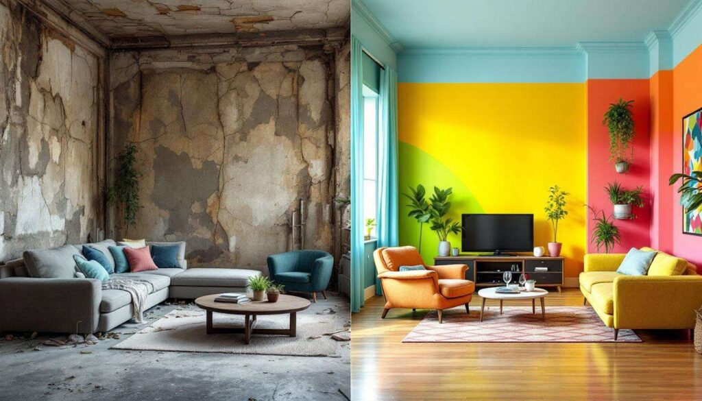
A bedroom in disrepair can weigh heavily on daily life, affecting both mood and rest quality. Peeling paint, dull walls, and a general sense of neglect transform what should be a personal sanctuary into a space one wishes to avoid. Yet, the solution often lies in a simple yet powerful tool: colour. Through strategic paint choices and thoughtful application, even the most tired bedroom can experience a dramatic rebirth, shifting from dreary to delightful without requiring extensive structural changes or significant financial investment.
Transforming a bedroom into a haven of peace
Assessing the initial state of the space
Before embarking on any transformation, a thorough evaluation of the bedroom’s current condition proves essential. Identifying problem areas such as damaged walls, poor lighting, or cluttered layouts helps establish a clear starting point. Many run-down bedrooms suffer from accumulated neglect: stained surfaces, outdated colour schemes, and furnishings that no longer serve their purpose. This assessment phase should include noting which elements can be salvaged and which require replacement or removal.
Establishing a vision for renewal
Creating a mental picture of the desired outcome guides every subsequent decision. Consider the following elements when developing your vision:
- The primary function of the space: restful sleep, reading, or multi-purpose use
- Personal style preferences: minimalist, traditional, contemporary, or eclectic
- Practical requirements: storage needs, lighting considerations, and traffic flow
- Emotional goals: creating calm, energising the space, or fostering creativity
A well-defined vision prevents haphazard decisions and ensures that colour choices align with the overall transformation goals. Photographs of inspiring spaces, mood boards, and paint samples all contribute to crystallising this vision before any physical work begins.
Preparing the room for transformation
Proper preparation distinguishes a professional-looking result from an amateur attempt. Remove all furniture possible, clean surfaces thoroughly, and repair any wall damage with filler. Sand rough patches and apply primer where necessary, particularly over dark or stained areas. This groundwork, though time-consuming, ensures that the new colours will appear true to their intended shade and adhere properly for lasting results.
With the foundation established and a clear vision in place, attention naturally turns to the palette that will bring this transformation to life.
The choice of colours: key to renewal
Understanding colour psychology in bedroom spaces
Colour selection extends far beyond aesthetic preference, touching upon psychological responses that influence how we experience a room. Cool tones such as blues, greens, and soft greys typically promote relaxation and lower heart rates, making them ideal for bedrooms. Warm hues like terracotta, soft peach, or muted yellow can create cosiness but require careful application to avoid overstimulation.
Popular colour schemes for bedroom renewal
Several proven colour combinations consistently deliver successful bedroom transformations:
| Colour Scheme | Primary Colour | Accent Colour | Effect |
|---|---|---|---|
| Coastal Calm | Soft blue-grey | White and sandy beige | Serene, airy atmosphere |
| Forest Retreat | Sage green | Natural wood tones | Grounding, peaceful |
| Modern Neutral | Warm grey | Charcoal and blush | Sophisticated, timeless |
| Warm Sanctuary | Soft taupe | Cream and terracotta | Cosy, enveloping |
Selecting colours for specific bedroom challenges
Different bedroom conditions require tailored colour approaches. Small bedrooms benefit from lighter shades that reflect light and create an illusion of expanded space. Rooms with limited natural light need warm undertones to prevent a cold, unwelcoming feel. Conversely, bedrooms receiving intense sunlight can handle deeper, more saturated colours without appearing oppressive. Feature walls offer an opportunity to introduce bolder colours whilst maintaining overall balance, particularly effective behind the bed head.
Once the colour palette has been determined, understanding how to apply these choices effectively becomes the next crucial step.
How painting facilitates a change of atmosphere
The transformative power of fresh paint
Few renovation techniques deliver such dramatic impact for relatively modest investment as painting. A fresh coat of paint immediately modernises a space, covering years of wear, stains, and outdated colour choices. The psychological effect of clean, intentionally chosen colours cannot be overstated: entering a freshly painted room feels fundamentally different from entering one with tired, neglected surfaces.
Techniques for maximising visual impact
Strategic painting techniques amplify the transformation beyond simple colour application:
- Two-tone walls: painting the lower third in a deeper shade creates visual interest and grounds the space
- Ceiling colour: extending wall colour onto the ceiling creates intimacy in large rooms
- Accent walls: highlighting architectural features or creating focal points through colour contrast
- Trim and detail work: painting skirting boards, door frames, and window surrounds in contrasting colours adds polish
Texture and finish considerations
Paint finish significantly influences the final atmosphere. Matte finishes absorb light, creating softness and hiding wall imperfections, ideal for relaxation-focused bedrooms. Eggshell and satin finishes offer subtle sheen whilst remaining practical for cleaning. Gloss finishes, typically reserved for trim work, add definition and reflect light but can highlight surface flaws. The interplay between different finishes within one room adds depth without requiring multiple colours.
However, even the most beautiful paint application cannot overcome certain fundamental errors that undermine bedroom renovations.
Mistakes to avoid when renovating a bedroom
Colour-related pitfalls
Several common mistakes can derail an otherwise promising bedroom transformation. Testing paint colours only on small sample cards proves insufficient: colours appear dramatically different when covering entire walls under various lighting conditions. Always paint large test patches and observe them throughout the day before committing. Similarly, following trends without considering personal preference and the room’s specific characteristics leads to dissatisfaction. A colour popular on social media may prove entirely unsuitable for your particular space and needs.
Planning and preparation oversights
Rushing into painting without adequate preparation consistently produces disappointing results. Skipping primer, particularly when covering dark colours or stained surfaces, leads to uneven coverage requiring multiple additional coats. Neglecting to protect flooring, furniture, and fixtures results in avoidable damage and stress. Poor quality brushes and rollers create streaks, leave bristles embedded in paint, and make the application process frustrating rather than satisfying.
Practical execution errors
Technical mistakes during application compromise the final appearance:
- Applying paint too thickly, causing drips and extended drying times
- Painting in extreme temperatures or humidity, affecting adhesion and finish
- Removing masking tape before paint fully dries, creating ragged edges
- Failing to maintain wet edges, resulting in visible lap marks
- Neglecting adequate ventilation, prolonging drying and intensifying fumes
Avoiding these pitfalls ensures that colour choices can work in harmony with existing and new furnishings to create a cohesive environment.
Tips for harmonising colours and furniture
Working with existing furniture pieces
Complete furniture replacement rarely proves necessary or financially viable. Instead, select wall colours that complement existing pieces, bringing out their best qualities. Dark wood furniture pairs beautifully with soft, light walls that prevent the room feeling heavy. Modern, minimalist furniture suits both bold accent walls and subtle neutral schemes. Upholstered pieces in patterned fabrics should inform colour selection: pull accent colours from the fabric pattern to create visual connection between walls and furnishings.
Creating balance through colour distribution
The 60-30-10 rule provides a reliable framework for colour distribution: 60 per cent dominant colour (typically walls), 30 per cent secondary colour (furniture, curtains), and 10 per cent accent colour (accessories, cushions, artwork). This proportion creates visual interest without overwhelming the senses. Repeating colours across different elements throughout the room establishes cohesion: if the walls feature soft blue-grey, echo this in throw pillows, artwork frames, or decorative objects.
Updating furniture to match new colour schemes
When existing furniture clashes with the new palette, consider these budget-friendly updates:
- Repainting wooden furniture pieces in complementary colours
- Replacing cabinet handles and drawer pulls with updated finishes
- Adding new bedding in colours that bridge wall and furniture tones
- Introducing area rugs that incorporate both old and new colour elements
- Updating lampshades to coordinate with the refreshed palette
These harmonious colour relationships extend beyond mere aesthetics, directly influencing the room’s functional success as a restorative space.
The impact of colours on well-being and sleep
Scientific understanding of colour and rest
Research consistently demonstrates that colour directly affects physiological responses including heart rate, blood pressure, and hormone production. Blue tones stimulate production of calming hormones, whilst red increases alertness and energy: clearly counterproductive for sleep spaces. Studies indicate that people sleeping in blue bedrooms average nearly eight hours of sleep nightly, compared to under seven hours in purple or brown rooms.
Colours that promote restful sleep
Certain colours demonstrate particular effectiveness for bedroom environments:
| Colour | Sleep Quality Impact | Additional Benefits |
|---|---|---|
| Blue | Excellent | Lowers blood pressure, reduces anxiety |
| Green | Very good | Promotes harmony, reduces stress |
| Soft yellow | Good | Creates warmth without overstimulation |
| Neutral beige | Good | Versatile, calming baseline |
Balancing personal preference with sleep science
Individual responses to colour vary based on personal associations and cultural background. Whilst general principles provide guidance, a colour that theoretically promotes sleep proves useless if the occupant finds it unappealing. The key lies in selecting colours from the calming spectrum that also resonate personally. Someone who finds grey depressing should choose soft blue or green instead, even if grey ranks highly in sleep studies. The bedroom transformation succeeds only when it serves both physiological needs and personal satisfaction.
A run-down bedroom reborn through colour demonstrates that dramatic transformation need not require extensive renovation or substantial budgets. Strategic colour selection, proper application techniques, and thoughtful integration with existing elements combine to create spaces that nurture rest and reflect personal style. By understanding colour psychology, avoiding common pitfalls, and harmonising all elements, anyone can transform a neglected bedroom into a haven that promotes well-being and provides genuine sanctuary from daily demands. The power of paint, wielded with intention and care, proves sufficient to completely reimagine how a space feels and functions.