


Sleep quality remains one of the most pressing concerns for homeowners seeking to transform their bedrooms into sanctuaries of rest. Interior designers frequently encounter clients struggling with restless nights, and their response often begins with a surprisingly simple solution: colour. The psychological impact of bedroom hues extends far beyond aesthetics, influencing our circadian rhythms, stress levels, and ability to drift into deep, restorative sleep. Research consistently demonstrates that certain colours possess remarkable properties that can either promote or hinder our natural sleep patterns. When professionals are tasked with creating sleep-friendly environments, they repeatedly turn to five specific colour palettes that have proven their effectiveness time and again.
The calming effects of blue on sleep
Why blue dominates sleep-friendly design recommendations
Blue stands as the undisputed champion amongst sleep-inducing colours, and interior designers cite it as their primary recommendation for clients experiencing sleep difficulties. The scientific reasoning behind this preference relates to specialised receptors in our retinas called ganglion cells, which are particularly sensitive to blue wavelengths. These receptors communicate directly with areas of the brain responsible for regulating our internal clock and heart rate, triggering a calming physiological response that prepares the body for sleep.
Studies conducted by hotel chains and sleep research institutions have revealed compelling statistics:
| Blue shade category | Average sleep duration | Reported sleep quality |
|---|---|---|
| Pale blue | 7 hours 52 minutes | 87% positive |
| Medium blue | 7 hours 36 minutes | 82% positive |
| Navy blue | 7 hours 18 minutes | 74% positive |
Selecting the right blue tone for your bedroom
Not all blues deliver identical results, and designers emphasise the importance of choosing the appropriate shade. Soft, powder blues with grey undertones create the most conducive environment for sleep, whilst brighter, more saturated blues can prove overstimulating. The key considerations include:
- Natural light exposure: rooms with abundant sunlight can accommodate slightly deeper blues
- Room size: smaller bedrooms benefit from lighter blues that enhance perceived spaciousness
- Personal associations: individuals with positive memories connected to blue environments respond more favourably
- Complementary elements: pairing blue walls with warm-toned textiles prevents the space from feeling cold
Whilst blue reigns supreme in sleep-promoting palettes, designers recognise that nature-inspired hues offer equally compelling benefits for those seeking tranquillity.
Pastel green: an invitation to relaxation
The psychological connection between green and restoration
Green occupies a unique position in colour psychology, serving as the visual representation of nature, growth, and renewal. Interior designers frequently recommend pastel green shades for clients whose sleep disturbances stem from stress and anxiety. The colour’s association with natural environments triggers an instinctive relaxation response, as humans have evolved to perceive green spaces as safe havens free from threats.
Pastel green possesses the remarkable quality of being neither warm nor cool, positioning it perfectly in the middle of the colour spectrum. This neutrality prevents the overstimulation that warmer colours can cause whilst avoiding the potential coldness of cooler tones. Designers particularly favour sage green, mint, and seafoam variations for their ability to create serene atmospheres without appearing clinical or sterile.
Implementing green tones effectively in sleep spaces
The successful application of pastel green requires thoughtful consideration of undertones and saturation levels. Designers recommend the following approaches:
- Opt for greens with grey or blue undertones rather than yellow-based variations
- Maintain low saturation levels to prevent the colour from becoming visually demanding
- Layer different green tones through textiles and accessories for depth without complexity
- Balance green walls with natural wood elements to reinforce the connection to nature
- Consider the lighting temperature, as warm bulbs can shift green tones towards yellow
Beyond the refreshing qualities of green, designers also recognise the sophisticated simplicity that neutral tones bring to restful environments.
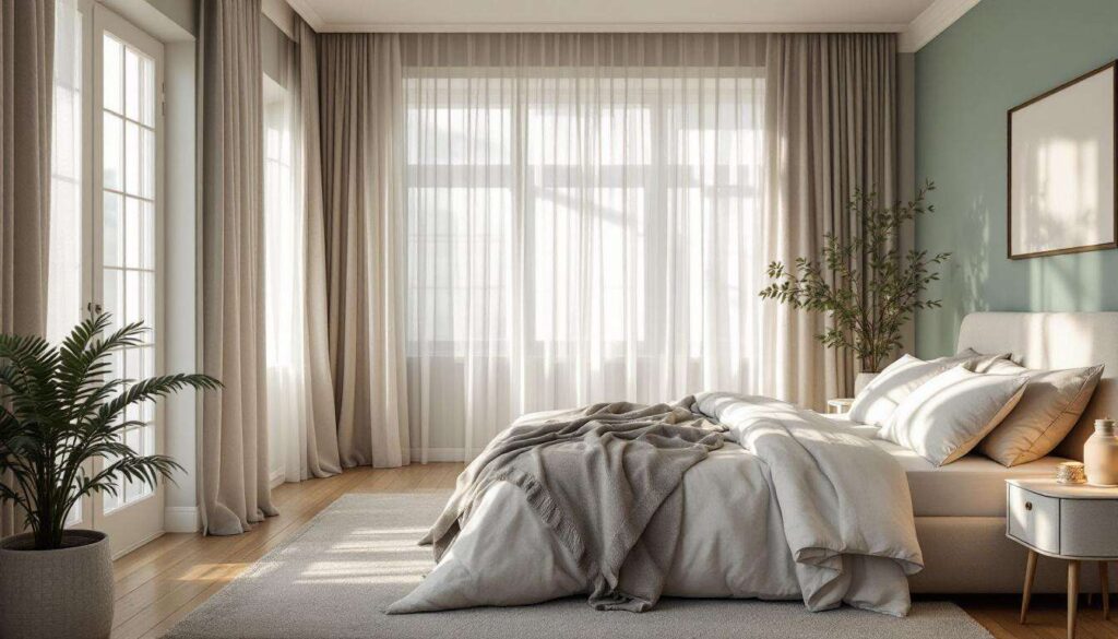
The soothing influence of beige in the bedroom
Understanding beige as a foundation for calm
Beige has experienced a remarkable renaissance in interior design, shedding its reputation as bland and emerging as a sophisticated choice for sleep-focused spaces. Designers appreciate beige for its remarkable versatility and its ability to create cocoon-like environments that feel simultaneously spacious and secure. The colour’s warm undertones provide psychological comfort without the stimulating effects associated with brighter warm colours like orange or yellow.
The effectiveness of beige stems from its unobtrusive nature. Unlike colours that demand visual attention, beige recedes into the background, allowing the mind to settle rather than engage. This quality proves particularly valuable for individuals whose thoughts race at bedtime, as the absence of visual stimulation reduces cognitive activity.
Navigating the spectrum of beige options
Contemporary beige encompasses a far broader range than many realise, and selecting the appropriate variation requires understanding subtle distinctions:
| Beige category | Undertone | Best suited for |
|---|---|---|
| Warm beige | Yellow/peach | North-facing rooms lacking natural warmth |
| Neutral beige | Balanced | Versatile application in any orientation |
| Greige | Grey | Modern spaces requiring sophistication |
| Cool beige | Pink/purple | South-facing rooms with abundant light |
Designers emphasise testing beige samples throughout the day, as the colour shifts dramatically depending on natural light conditions. The right beige should feel enveloping at night whilst remaining fresh during daytime hours.
Whilst beige offers warmth and comfort, some clients prefer the contemporary elegance that grey tones provide.
Shades of grey: simplicity and relaxation
The minimalist appeal of grey in sleep environments
Grey has become increasingly prevalent in bedroom design, particularly amongst clients drawn to minimalist aesthetics and uncluttered spaces. Interior designers value grey for its ability to create calm through visual simplicity, eliminating the distraction that more colourful schemes can introduce. The colour’s neutral quality allows the mind to disengage from visual processing, facilitating the mental quietness necessary for sleep onset.
The psychological impact of grey relates to its association with stability, balance, and timelessness. Unlike trendy colours that may eventually feel dated or tiresome, grey maintains its relevance and continues to feel appropriate regardless of changing preferences. This longevity proves particularly valuable in bedrooms, where consistency and familiarity contribute to feeling secure and comfortable.
Avoiding common pitfalls with grey bedroom schemes
Despite its numerous advantages, grey requires careful implementation to prevent spaces from feeling cold or institutional. Designers recommend these strategies:
- Layer multiple grey tones rather than relying on a single shade throughout
- Introduce warm-toned textiles and wood elements to counterbalance grey’s coolness
- Ensure adequate lighting, as grey can appear drab in poorly lit conditions
- Consider the room’s orientation: south-facing rooms accommodate cooler greys, whilst north-facing spaces benefit from warmer variations
- Incorporate texture through fabrics and materials to prevent visual flatness
The key distinction between successful and unsuccessful grey bedrooms lies in understanding undertones. Blue-grey variations can feel too cold for some individuals, whilst greige options provide additional warmth. Designers typically conduct extensive sampling to identify the grey that feels most comfortable to specific clients.
For those seeking warmth without the intensity of traditional warm colours, pale pink offers an intriguing alternative.
Why does pale pink promote restorative sleep ?
The unexpected science behind pink’s calming properties
Pale pink might seem an unconventional choice for sleep-focused design, yet interior designers increasingly recommend it for clients requiring particularly nurturing and calming environments. The colour’s effectiveness stems from research conducted in correctional facilities and psychiatric units, where a specific shade known as Baker-Miller pink demonstrated remarkable abilities to reduce aggression and promote calmness. Whilst bedroom applications utilise softer variations, the underlying principle remains: pink possesses genuine physiological calming effects.
The colour works by lowering heart rate and reducing feelings of agitation, creating ideal conditions for the parasympathetic nervous system to engage. This biological response occurs regardless of gender associations or cultural conditioning, making pink a scientifically sound choice despite any preconceptions about its appropriateness.
Implementing pink without overwhelming the space
The successful incorporation of pale pink requires restraint and sophistication. Designers emphasise these approaches:
- Select pink shades with grey or beige undertones rather than bright, saturated versions
- Use pink as the primary wall colour rather than an accent to maximise its calming effects
- Pair pink with natural materials and neutral tones to create balance
- Consider dusty rose, blush, and shell pink as sophisticated alternatives to traditional pink
- Ensure lighting doesn’t amplify the pink tone excessively, which can negate its calming properties
Contemporary pink applications bear little resemblance to traditional interpretations, instead offering subtle, sophisticated environments that feel modern and intentional. When executed properly, pink bedrooms provide some of the most restful environments designers create, particularly for clients experiencing high stress levels or anxiety-related sleep disturbances.
The connection between colour and sleep quality represents far more than aesthetic preference. The five colours interior designers consistently recommend—blue, pastel green, beige, grey, and pale pink—each offer distinct psychological and physiological benefits that facilitate better rest. Whether through blue’s direct impact on circadian rhythms, green’s association with natural tranquillity, beige’s comforting neutrality, grey’s minimalist calm, or pink’s surprising ability to reduce agitation, these colours provide scientifically supported pathways to improved sleep. Transforming a bedroom into a sleep sanctuary begins with understanding that colour choices extend beyond decoration, functioning as powerful tools that shape our nightly rest and overall wellbeing.