


Dark rooms present a common challenge for homeowners and interior designers alike. Whether caused by limited natural light, north-facing windows, or architectural constraints, these spaces often feel cramped and unwelcoming. The right paint colour can transform such environments, creating an illusion of brightness and space whilst maintaining style and sophistication. Professional designers consistently turn to specific shades that maximise light reflection and enhance the perceived dimensions of a room. Understanding which colours work best requires knowledge of light behaviour, undertones, and the psychological impact of different hues on spatial perception.
Colours that illuminate: informed choices
Understanding light reflection principles
The science behind brightening dark rooms centres on light reflectance value, commonly abbreviated as LRV. This measurement indicates how much light a colour reflects on a scale from zero to one hundred, with higher values denoting greater reflectivity. Designers emphasise that colours with an LRV above fifty typically brighten spaces effectively, whilst those below thirty absorb light and create darker environments. Strategic colour selection based on LRV can dramatically alter a room’s atmosphere without structural modifications or expensive lighting installations.
Considering undertones and natural light
Every paint colour contains undertones that become more apparent in different lighting conditions. Designers stress the importance of testing paint samples on multiple walls throughout the day to observe how natural light affects the chosen shade. Cool undertones tend to recede visually, creating depth, whilst warm undertones advance and create cosiness. The direction of natural light significantly influences colour perception:
- North-facing rooms receive cooler, bluer light requiring warmer paint colours
- South-facing spaces benefit from abundant warm light that suits cooler tones
- East-facing rooms experience morning brightness and afternoon shadows
- West-facing areas glow with warm afternoon and evening light
These principles guide designers towards colours that complement rather than fight against existing light conditions, establishing a foundation for the specific shade recommendations that follow.
Bright white: a timeless classic
The versatility of pure white
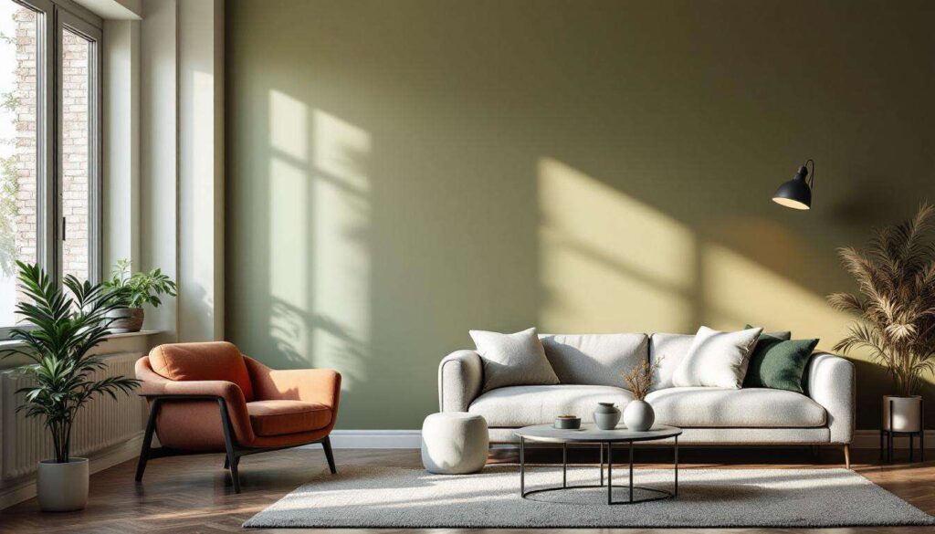
Bright white remains the most reliable choice for maximising light in dark rooms, according to leading interior designers. Pure white paint reflects the maximum amount of available light, creating an immediate sense of spaciousness and airiness. Unlike off-whites or creams, true white provides a clean backdrop that allows furniture and accessories to stand out whilst maintaining visual clarity. Designers particularly recommend shades with minimal undertones for rooms with very limited natural light, as these create the strongest brightening effect.
Popular white paint selections
| Paint name | LRV | Best application |
|---|---|---|
| Pure brilliant white | 93 | Windowless spaces |
| All white | 89 | Basement rooms |
| Strong white | 87 | North-facing areas |
The challenge with bright white lies in avoiding a clinical or sterile appearance. Designers suggest incorporating textured fabrics, natural materials, and layered lighting to add warmth and depth. This approach maintains the brightening benefits whilst creating a liveable, inviting atmosphere rather than an institutional feel. Beyond pure white, designers also explore colours that bring personality whilst still maximising light reflection.
Vibrant yellow: a sunny touch
Harnessing yellow’s energising properties
Yellow paint introduces instant warmth and cheerfulness to dark spaces, mimicking the effect of natural sunlight. Designers favour pale butter yellows and soft primrose shades that brighten without overwhelming the senses. These colours work particularly well in kitchens, breakfast rooms, and home offices where energy and positivity enhance functionality. The key lies in selecting yellows with sufficient white content to maintain high light reflectance whilst retaining the colour’s characteristic warmth.
Application considerations for yellow
Professional designers caution against overly saturated yellows in small dark rooms, as intense shades can create visual fatigue. Instead, they recommend testing samples in various lights to ensure the yellow reads as fresh rather than dingy. Pairing yellow walls with white trim creates definition and prevents the colour from feeling monotonous. Yellow also complements both traditional and contemporary design schemes when balanced with neutral furnishings and natural textures. This sunny approach differs from the calming effect achieved through softer colour palettes.
Soft pastels: subtle clarity
The gentle power of pastel shades
Pastel colours offer an excellent compromise between pure white and more saturated hues, providing personality without sacrificing brightness. Designers particularly recommend pale pink, soft peach, and light lavender for bedrooms and living spaces where a soothing atmosphere complements the need for brightness. These colours contain substantial white content, ensuring high LRV values whilst introducing subtle colour interest that prevents rooms from feeling stark or cold.
Recommended pastel applications
- Blush pink creates warmth in north-facing bedrooms
- Pale mint adds freshness to bathrooms with limited windows
- Soft coral energises dark hallways and corridors
- Light lilac introduces tranquillity to meditation or reading spaces
The success of pastels depends on maintaining their delicate nature through careful colour selection. Designers advise choosing shades that appear almost white on the paint chip, as these will read as gentle colour on walls whilst maximising light reflection. Pastel schemes benefit from white ceilings and trim to enhance brightness and create architectural interest. These soft hues provide a bridge to more contemporary neutral options that have gained popularity recently.
Light greys: modern brightness
Grey’s contemporary appeal
Light grey has emerged as a designer favourite for brightening dark rooms whilst maintaining a sophisticated, modern aesthetic. Unlike darker greys that absorb light, pale greys with LRV values above seventy reflect substantial light whilst offering more visual interest than pure white. Designers appreciate grey’s versatility, as it complements virtually any accent colour and suits both minimalist and traditional interiors. The key lies in selecting greys with warm rather than cool undertones to prevent rooms from feeling cold or unwelcoming.
Selecting the right grey tone
The challenge with grey paint stems from its chameleon-like nature, as undertones become pronounced in different lighting conditions. Designers recommend testing multiple grey samples to identify whether a shade leans blue, green, or violet in your specific space. Warm greys with beige or taupe undertones typically perform best in dark rooms, as they maintain brightness whilst adding subtle warmth. Pairing light grey walls with crisp white woodwork creates definition and enhances the perception of space, a technique that works equally well with cooler colour families.
Light blue: a breath of fresh air
Blue’s calming brightness
Light blue paint colours bring serenity and spaciousness to dark rooms, particularly those used for relaxation or concentration. Designers favour pale sky blues and soft powder blues that maintain high LRV values whilst introducing colour character. Blue’s psychological associations with open skies and water create an expansive feeling that counteracts the confined sensation often present in dark spaces. These shades work exceptionally well in bedrooms, bathrooms, and studies where a peaceful atmosphere enhances the room’s function.
Maximising blue’s potential
The success of light blue in dark rooms depends on selecting shades with sufficient grey or white content to prevent them from appearing cold or dull. Designers suggest avoiding blues with green undertones in rooms with limited natural light, as these can read as murky rather than fresh. Combining light blue walls with warm wood tones and brass fixtures creates balance and prevents the space from feeling too cool. This colour choice particularly benefits rooms with eastern exposure, where morning light enhances blue’s clarity and freshness.
| Blue shade type | Recommended rooms | Complementary accents |
|---|---|---|
| Powder blue | Bedrooms, nurseries | White, cream, natural wood |
| Sky blue | Bathrooms, studies | Chrome, glass, white tiles |
| Duck egg | Living rooms, hallways | Grey, taupe, soft green |
Transforming a dark room through strategic paint colour selection remains one of the most cost-effective design interventions available. The six colour families recommended by professional designers each offer distinct advantages, from white’s maximum light reflection to yellow’s energising warmth, pastels’ gentle charm, grey’s contemporary sophistication, and blue’s calming expansiveness. Success depends on understanding light reflectance values, testing samples in actual room conditions, and considering how undertones interact with existing light sources. By applying these designer-approved principles, any dark space can achieve newfound brightness and visual appeal without structural modifications or extensive renovations.