


Paint colour forecasts have become an essential barometer for understanding broader cultural shifts and consumer preferences. As we approach the next chapter in interior design, the palette predicted for homes reveals a collective yearning for authenticity, warmth, and a reconnection with the natural world. The colours emerging from industry experts suggest a decisive move away from the cool, sterile tones that dominated recent years, embracing instead hues that evoke comfort, grounding, and emotional resonance.
Colour Trends for 2026: experts’ Predictions
The Shift Towards Richer, Darker Tones
Industry specialists have observed a significant transformation in consumer preferences, with homeowners gravitating towards deeper, more saturated colours that convey personality and character. The era of grey dominance appears to be drawing to a close, replaced by shades that offer warmth and timeless appeal. Colour authorities emphasise that clients now seek hues that transcend fleeting trends, favouring choices that will remain relevant and visually appealing for years to come.
This movement reflects broader cultural changes, where individuals desire spaces that provide security, comfort, and authenticity. The colours selected for interiors are no longer purely aesthetic decisions but rather emotional statements that reflect personal values and aspirations. Experts note that consumers are increasingly drawn to shades that tell a story and create meaningful connections within their living environments.
| Colour Name | Brand | Description |
|---|---|---|
| Melodious Ivory | Dutch Boy | Creamy beige creating soft, warm atmosphere |
| Warm Mahogany | Glidden | Rich red-brown adding warmth to spaces |
| Universal Khaki | Sherwin-Williams | Earthy tan with yellow undertones |
| Silhouette | Benjamin Moore | Rich espresso brown alternative to cool tones |
The Quest for Timeless Aesthetics
The emphasis on classic, enduring colours marks a departure from the rapid trend cycles that previously characterised interior design. Homeowners are investing in paint choices that offer longevity and versatility, creating foundations that can accommodate evolving décor preferences without requiring complete redecoration. This approach reflects a more sustainable mindset, where quality and permanence take precedence over temporary fashion statements.
- Preference for colours with historical resonance and proven appeal
- Selection of hues that complement natural materials and textures
- Investment in shades that enhance rather than dominate interior spaces
- Focus on colours that adapt to various lighting conditions throughout the day
These predictions naturally lead to an examination of the specific colour families that will shape interior environments in the coming period.
The Organic Tones that Will Dominate
Nature-Inspired Neutrals
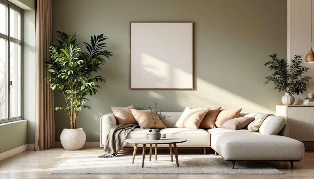
The palette emerging for residential spaces draws heavily from natural landscapes and organic materials. These tones create a sense of grounding and connection to the earth, offering respite from the increasingly digital nature of modern life. The colours selected reflect elements found in nature, from sun-baked clay to forest undergrowth, bringing the outdoors inside in subtle, sophisticated ways.
Earthy neutrals have evolved beyond simple beiges and tans to encompass a broader spectrum of warm, complex hues. These shades contain multiple undertones that shift and change depending on natural light, creating dynamic surfaces that maintain visual interest throughout the day. The sophistication of these colours lies in their ability to appear simultaneously familiar and fresh, comforting yet contemporary.
The Appeal of In-Between Colours
A particularly notable trend involves the rise of intermediate shades that resist easy categorisation. These colours occupy the space between traditional colour families, offering nuance and subtlety that appeals to refined aesthetic sensibilities. Such hues provide flexibility in design schemes, serving as ideal backgrounds for bolder accent colours whilst maintaining sufficient character to stand alone.
- Taupe variations that have maintained popularity for multiple consecutive years
- Creamy ivories that offer warmth without overwhelming brightness
- Soft khakis with yellow undertones creating welcoming environments
- Muted terracottas bringing gentle warmth to interior walls
These organic neutrals set the stage for exploring specific colour families that will define interiors in the near future.
The Impact of Earthy Greens and Browns
Olive Green: the Comfort Colour
Among the standout predictions, olive green emerges as a particularly significant choice for creating intimate, comfortable spaces. This rich, earthy tone evokes feelings of privacy and security, making it ideal for bedrooms, studies, and other retreat-like areas within the home. Unlike brighter greens that can feel energising or clinical, olive provides a sense of calm sophistication that encourages relaxation and contemplation.
The appeal of olive green lies in its versatility and depth. This shade works exceptionally well with natural materials such as wood, stone, and linen, creating cohesive, harmonious interiors that feel intentional rather than contrived. Its connection to nature makes it particularly appropriate for homes seeking to blur the boundaries between indoor and outdoor living spaces.
Brown: the New Black
Perhaps the most dramatic shift in colour preferences involves the elevation of brown tones to prominence in interior schemes. Espresso brown, in particular, has gained recognition as an attractive alternative to cooler tones like black or charcoal. This development reflects growing interest in antique woods and vintage furniture, where rich brown patinas convey heritage and quality.
| Brown Variation | Characteristics | Best Applications |
|---|---|---|
| Espresso Brown | Deep, warm, coffee-inspired | Feature walls, cabinetry, trim |
| Warm Mahogany | Red-brown with richness | Dining rooms, libraries, studies |
| Oiled Bronze | Almost black with metallic undertones | Dramatic accent walls, architectural details |
Browns offer a gentle warmth that black cannot match, whilst still providing the depth and drama that homeowners seek. These shades create sophisticated backdrops that enhance rather than compete with furnishings and artwork. The metallic undertones present in certain brown variations, such as oiled bronze, add an additional layer of complexity and visual interest.
Whilst earthy tones dominate predictions, other colour families are also making significant contributions to the palette.
What’s New: blue Hues and Their Variations
The Continuing Evolution of Blue
Although not as dominant as earth tones, blue shades continue to evolve and find their place in contemporary interiors. The blues predicted for the coming period differ from previous iterations, moving away from cool, stark tones towards warmer, more complex variations that incorporate grey or green undertones. These modified blues maintain the calming properties associated with the colour whilst offering greater compatibility with the warmer palette now preferred.
The appeal of these nuanced blues lies in their ability to provide visual coolness without coldness. They offer balance in schemes dominated by warm tones, creating contrast and preventing spaces from feeling monotonous. When used strategically, these blues can enhance natural light and create the illusion of greater space, particularly valuable in smaller rooms or areas with limited windows.
Strategic Applications for Blue
- Bathrooms and powder rooms where freshness remains desirable
- Bedrooms seeking tranquil, restful atmospheres
- Accent walls providing counterpoint to warm-toned rooms
- Ceilings creating unexpected visual interest overhead
The strategic use of blue demonstrates how colour trends accommodate multiple preferences and functional requirements within a cohesive overall direction.
The Neutral Pink Revolution
Redefining Pink for Modern Interiors
A surprising development in colour forecasting involves the emergence of neutral pink tones as sophisticated alternatives to traditional neutrals. These are not the bright, saturated pinks of previous decades but rather muted, earthy variations that incorporate brown, beige, or grey undertones. The result is a colour that reads as warm and inviting without appearing overtly feminine or juvenile.
These neutral pinks offer particular appeal for creating soft, nurturing environments that feel contemporary rather than dated. They work exceptionally well in spaces designed for relaxation and self-care, including bedrooms, dressing rooms, and bathrooms. The warmth they provide surpasses that of traditional beiges whilst maintaining the versatility that makes neutrals practical choices for long-term use.
Pantone’s Influence: Cloud Dancer
The selection of Cloud Dancer 11-4201, an ethereal white, as a significant colour choice reflects the desire for calm and clarity in living spaces. This shade represents the lighter end of the spectrum, offering a sophisticated alternative to stark white that brings warmth and softness to interiors. Its subtle complexity allows it to function as both a primary wall colour and a complementary shade for trim and architectural details.
Cloud Dancer exemplifies the trend towards nuanced neutrals that possess character without overwhelming spaces. It serves as an ideal backdrop for the richer, more saturated accent colours predicted for furnishings and accessories, allowing these elements to shine whilst maintaining a cohesive, harmonious overall effect.
Beyond wall colours themselves, innovative approaches to paint application are reshaping how colour functions in interior spaces.
Highlight on the ‘6th Wall’ Trend in Interior Painting
Expanding the Canvas: ceilings as Design Features
The concept of the ‘6th wall’ refers to the growing practice of treating ceilings as integral design elements rather than default white surfaces. This approach recognises that ceilings occupy significant visual space and represent untapped opportunities for colour and creativity. By extending colour schemes to overhead surfaces, designers create more immersive, cohesive environments that feel intentionally composed.
Painting ceilings in colours other than white can dramatically alter the perception of room proportions and atmosphere. Darker ceiling colours can make tall rooms feel more intimate and grounded, whilst lighter shades can enhance the sense of height and airiness. The choice of ceiling colour influences how natural and artificial light behaves within a space, creating subtle shifts in ambiance throughout the day.
Strategic Approaches to Ceiling Colour
- Matching ceiling colour to walls for enveloping, cocoon-like effects
- Selecting slightly lighter or darker versions of wall colours for subtle definition
- Using contrasting colours to create architectural interest and visual drama
- Applying metallic or reflective finishes to enhance light distribution
This trend demonstrates how colour forecasting extends beyond simple hue selection to encompass innovative application techniques that maximise the impact of chosen shades. The 6th wall approach requires confidence and vision but rewards homeowners with truly distinctive interiors that reflect contemporary design thinking.
The paint colour predictions for the coming period reflect profound shifts in how individuals relate to their living spaces. The emphasis on warm, organic tones signals a collective desire for authenticity, comfort, and connection with nature. Rich olive greens, deep espresso browns, and sophisticated neutral pinks replace the cool greys that dominated recent years, offering homeowners palettes that feel both timeless and emotionally resonant. The elevation of browns as alternatives to black, the evolution of nuanced blues, and the innovative 6th wall trend demonstrate that colour choices extend beyond mere aesthetics to encompass functional and psychological considerations. These predictions provide homeowners with options that create not just beautiful spaces but environments that nurture wellbeing and reflect personal values. The colours emerging for interiors represent a thoughtful response to contemporary life, offering refuge, warmth, and enduring appeal that transcends fleeting fashion.